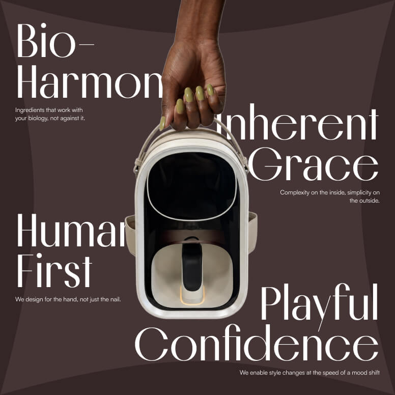
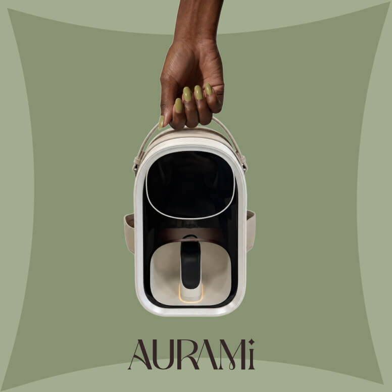
Our approach began long before visual design. With no direct competitors or established category codes to follow, we first conducted an extensive style positioning study across three adjacent markets: beauty technology, professional nail systems, and identity-driven lifestyle brands. This process revealed a clear opportunity for AURAMI to occupy a unique space between functionality, self-expression, and modern femininity—positioning the brand not simply as a beauty device, but as a beauty-tech lifestyle brand.
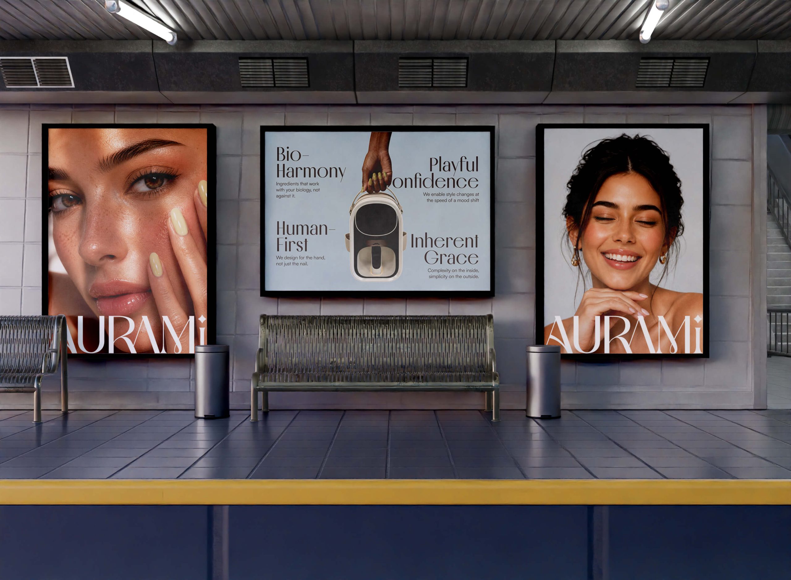
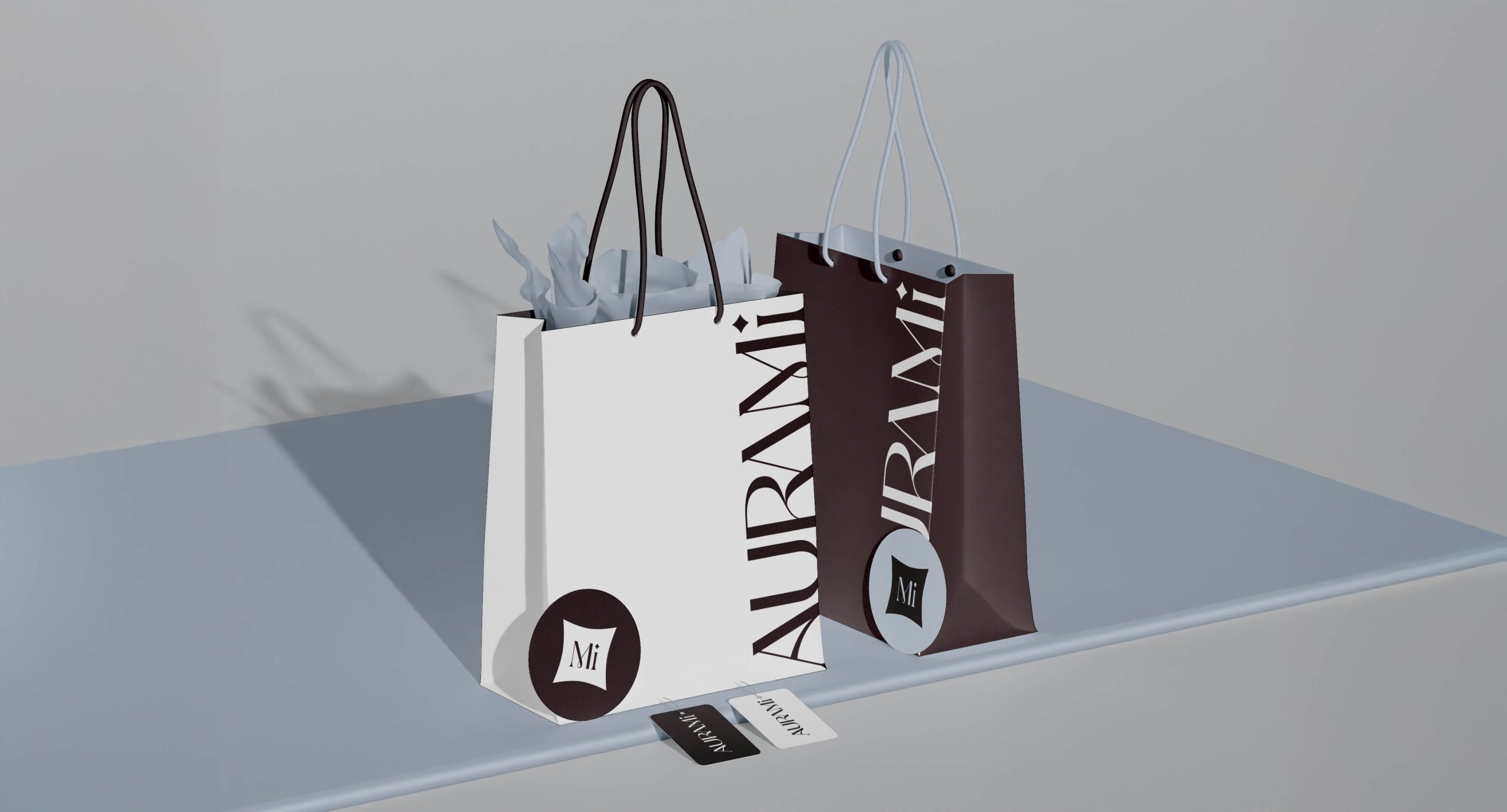
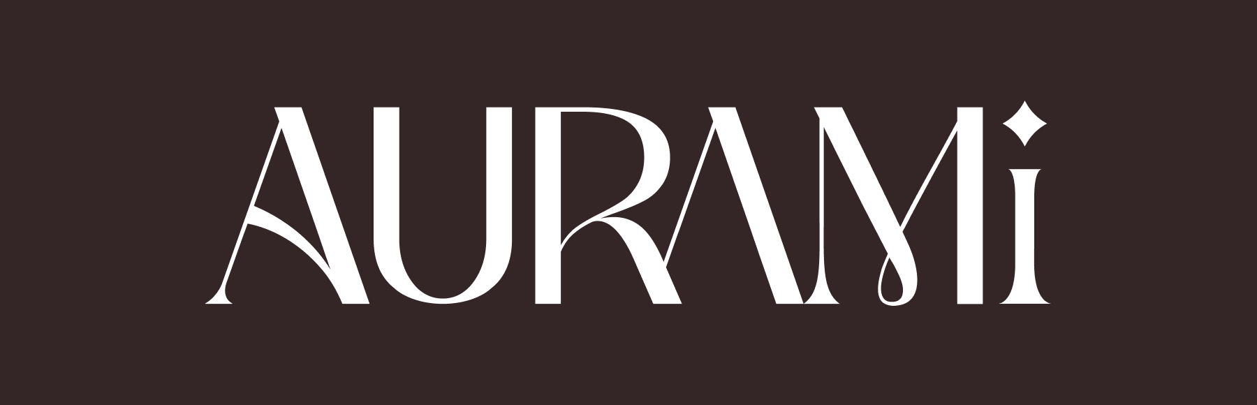
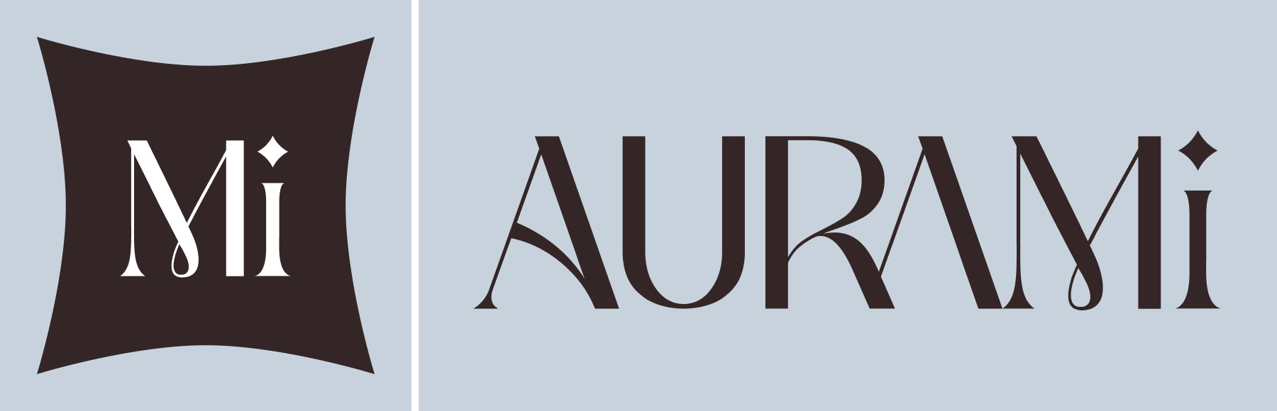
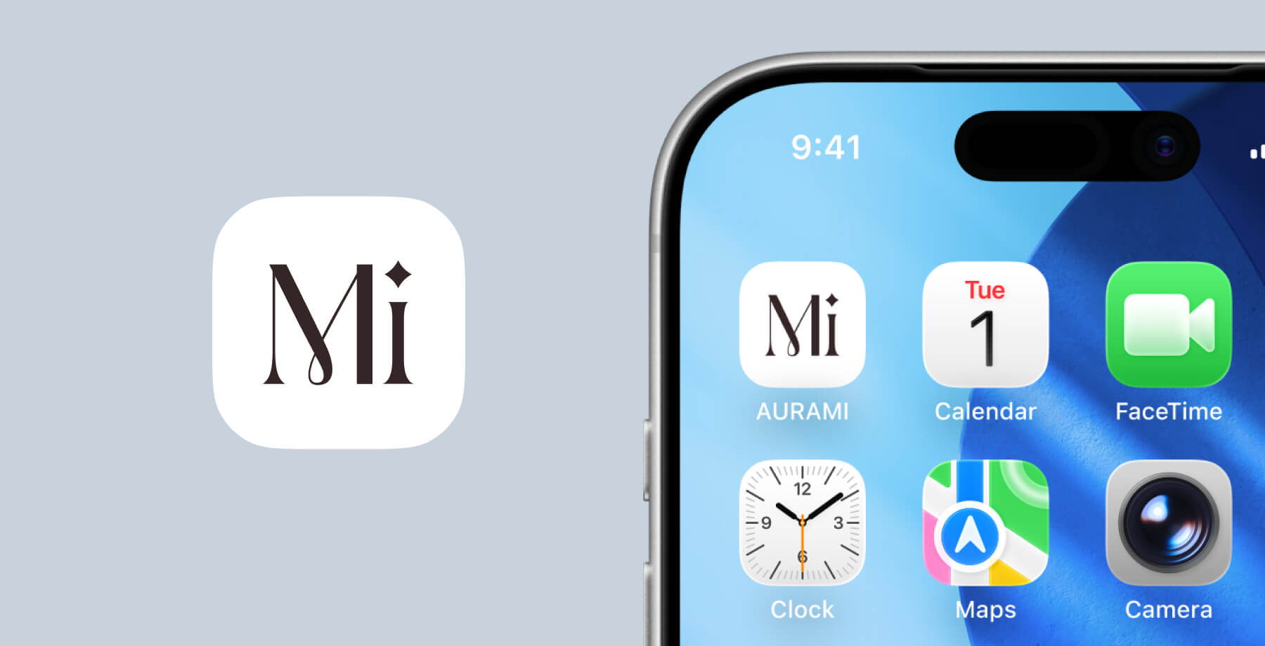
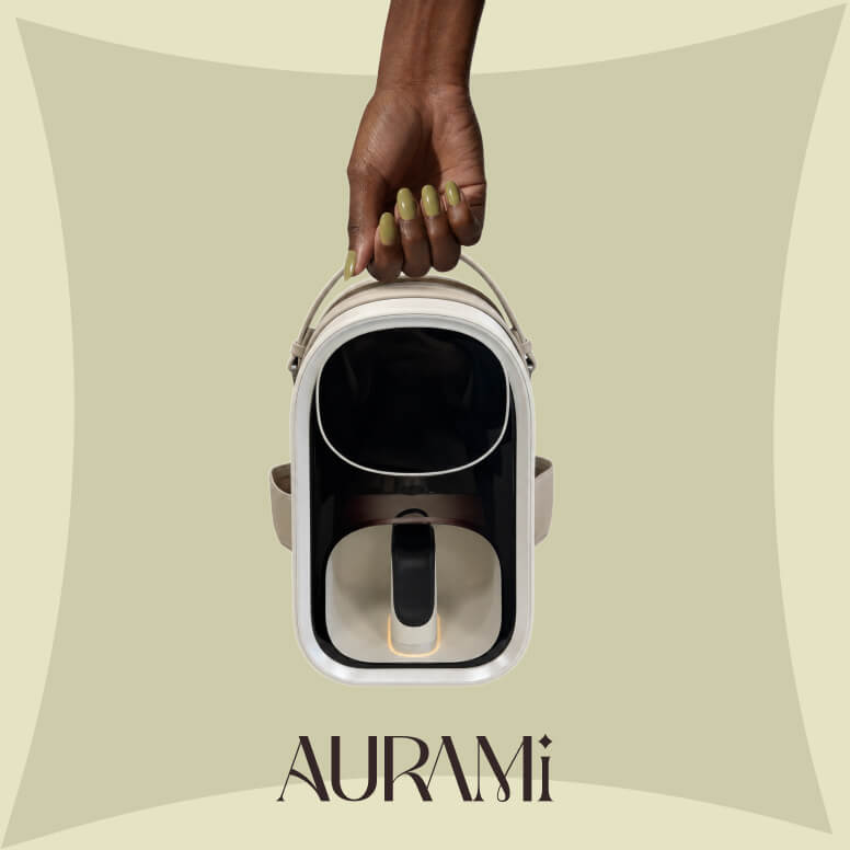
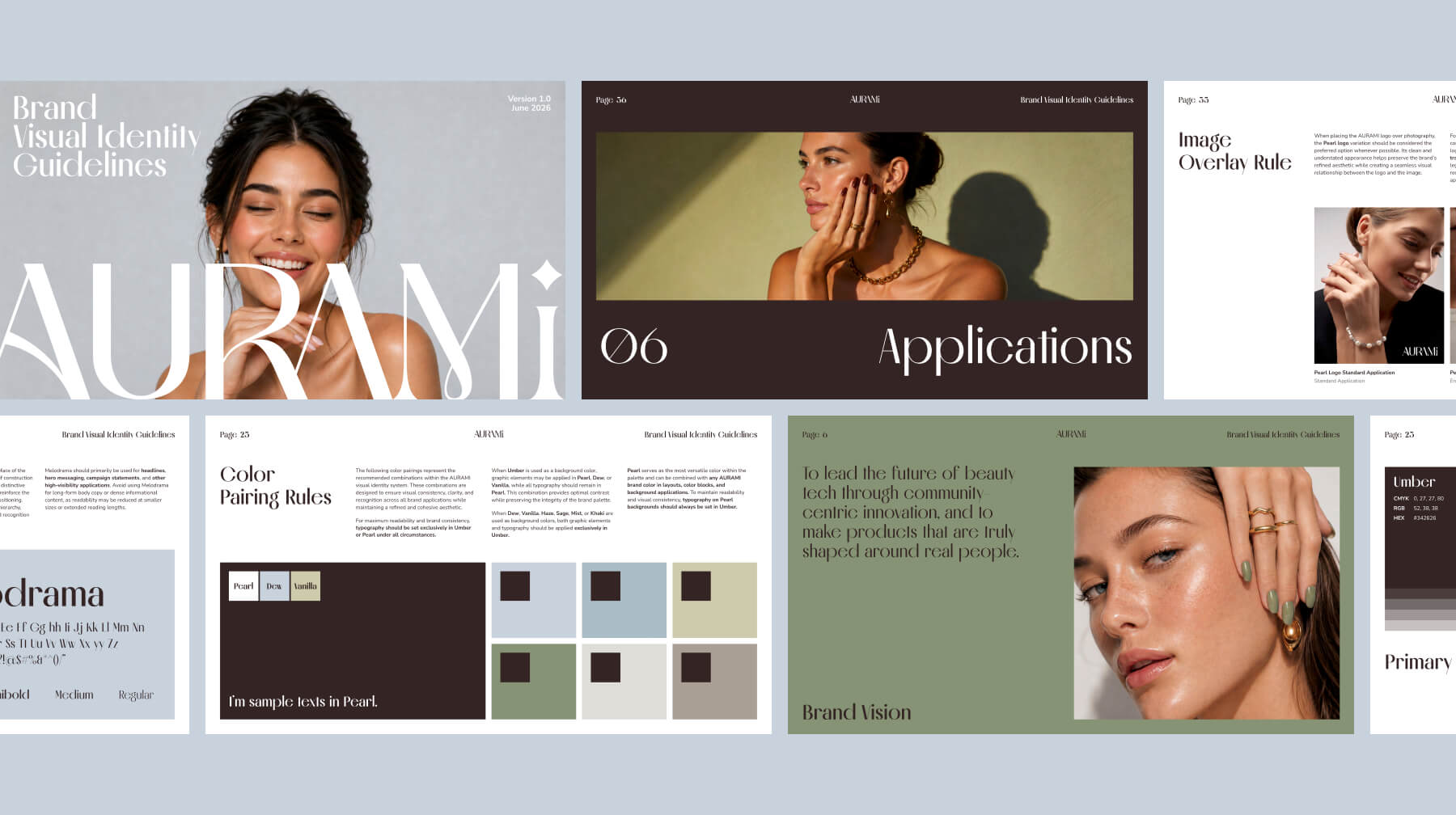
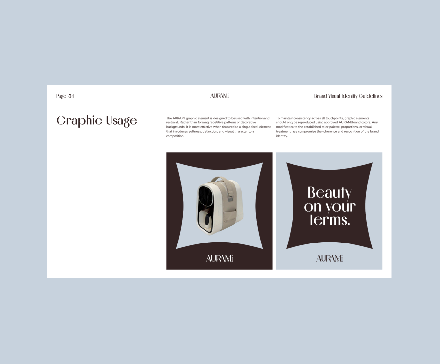
This strategic foundation informed every design decision that followed. Rather than adopting the overly clinical aesthetics often seen in technology brands, or the soft, trend-driven visuals common within beauty, we developed a visual identity that balances structure with elegance. A distinctive wordmark logo became the centerpiece of the identity, using refined proportions, high-contrast letterforms, and a signature star detail to create recognition through restraint rather than decoration.
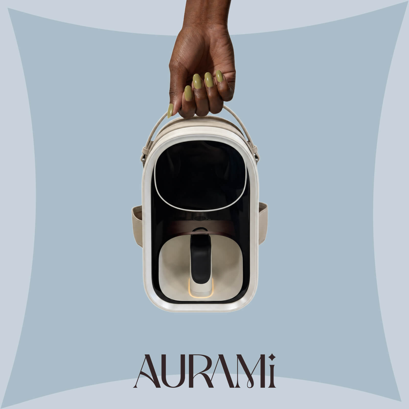
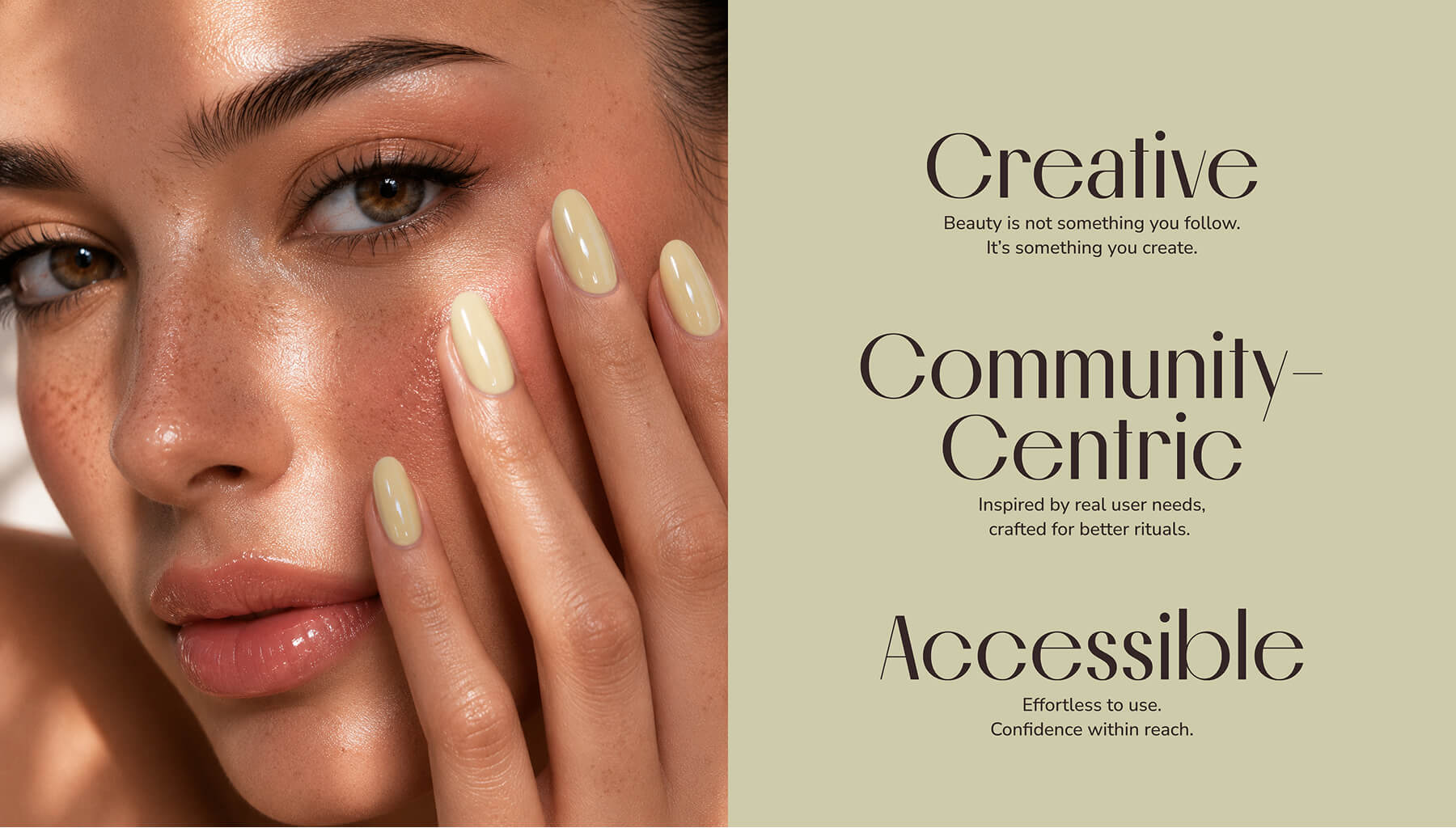
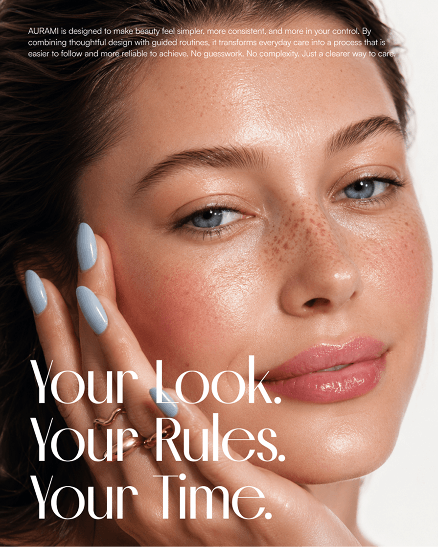
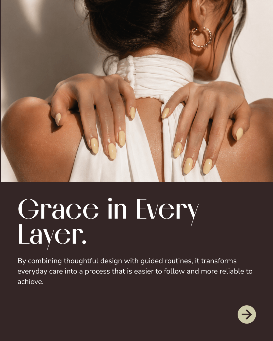
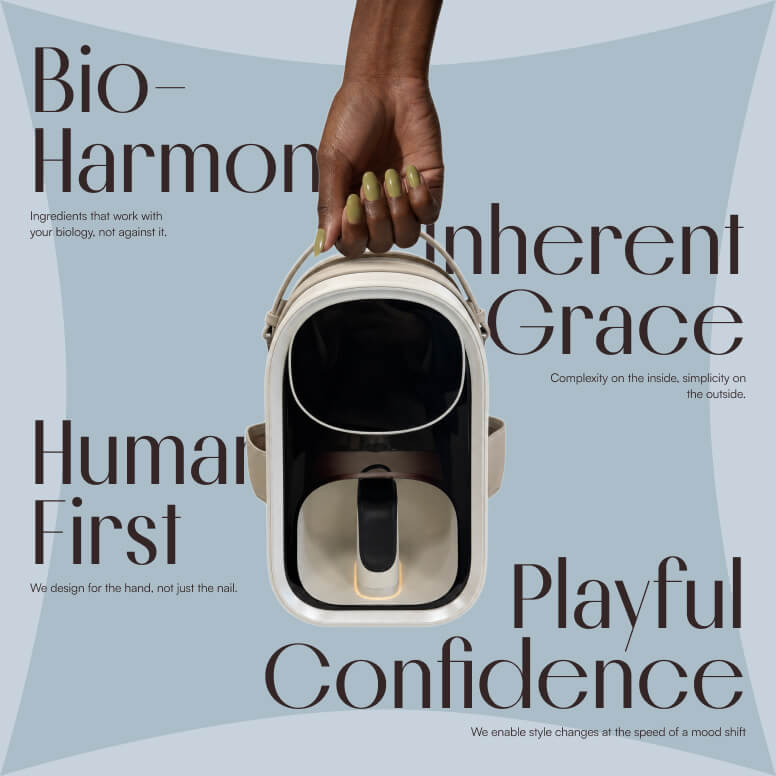
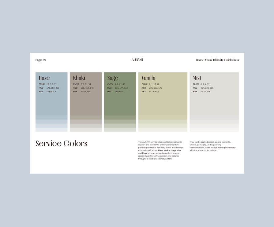
To further reinforce this positioning, we paired the expressive serif typography of Melodrama with the clarity and accessibility of Nunito Sans, creating a visual system that feels editorial yet approachable. The color palette was intentionally built around muted, sophisticated tones—including Umber, Dew, Pearl, Sage, and Vanilla—to communicate calm confidence, premium quality, and contemporary femininity, while avoiding the clichés of traditional beauty branding.
The result is a cohesive brand world that feels elegant, confident, and highly distinctive—translating an undefined market opportunity into a recognizable visual language that can scale consistently across products, packaging, digital experiences, and future brand growth.