tekind GROUP

AURAMI Brand strategy & visual identity system

Defining a new beauty-tech category through distinctive branding

The Client

The Client

AURAMI is an emerging beauty technology brand under the Hello Group ecosystem, focused on reimagining the at-home beauty experience through innovation and intelligent design. Combining advanced technology with a user-centered approach, the brand aims to make professional-quality beauty solutions more accessible, empowering users to express themselves with confidence and ease.

As a new entrant in an emerging category, AURAMI sought to establish a distinctive brand identity from the ground up—one capable of communicating both technological innovation and modern femininity while standing apart in a rapidly evolving market.

The Challenge

The Challenge

Unlike traditional beauty categories, AURAMI operates within a rapidly emerging space with few direct competitors and no clearly established visual conventions. Existing references were fragmented across multiple adjacent industries, making it difficult to define a clear market position or visual direction.

The challenge was not simply to create a logo, but to identify where the brand should sit within the broader beauty, lifestyle, and technology landscape—and develop a visual language that felt distinctive, credible, and emotionally relevant to its target audience.

Our Solution

Our Solution

Our approach began long before visual design. With no direct competitors or established category codes to follow, we first conducted an extensive style positioning study across three adjacent markets: beauty technology, professional nail systems, and identity-driven lifestyle brands. This process revealed a clear opportunity for AURAMI to occupy a unique space between functionality, self-expression, and modern femininity—positioning the brand not simply as a beauty device, but as a beauty-tech lifestyle brand.

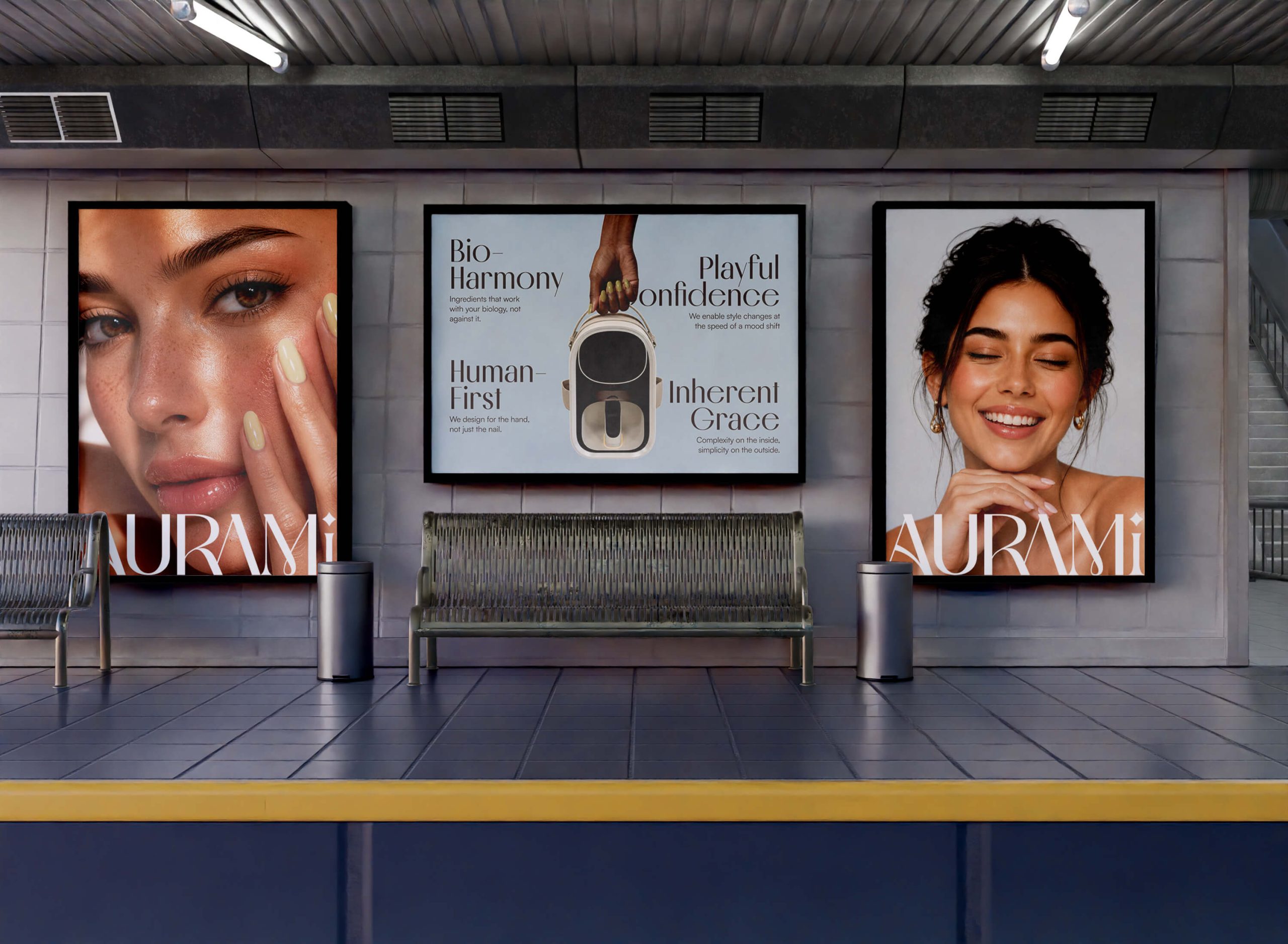
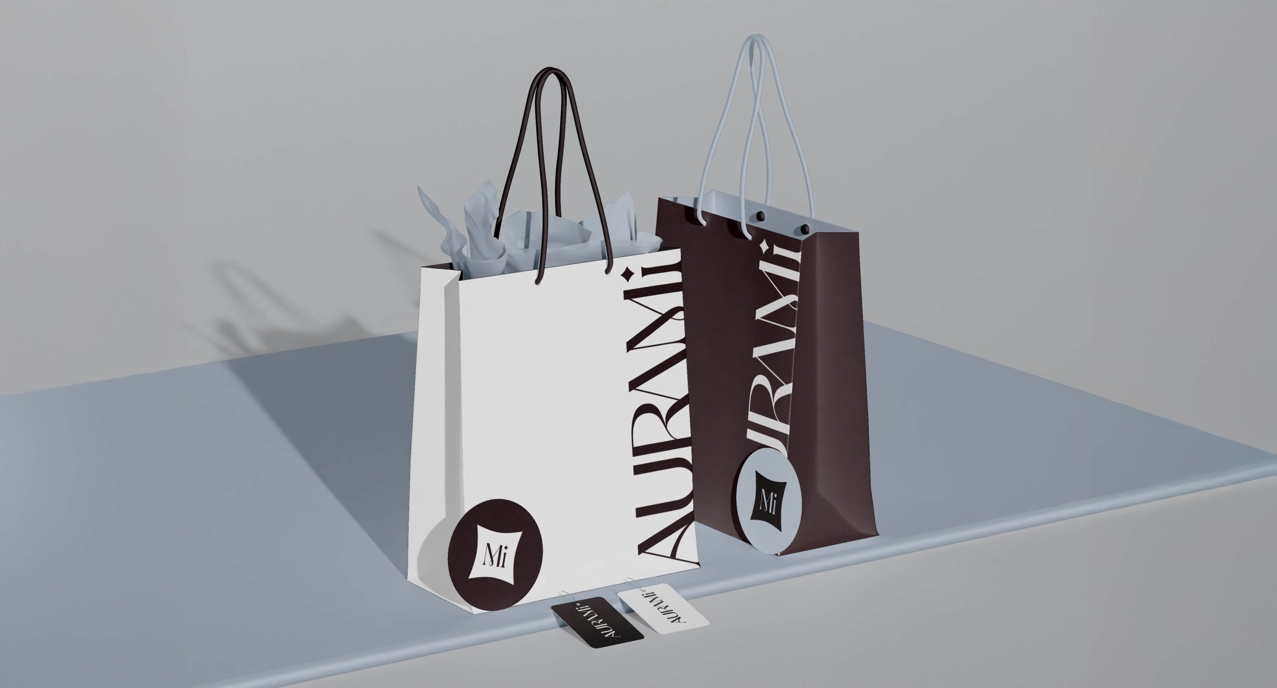
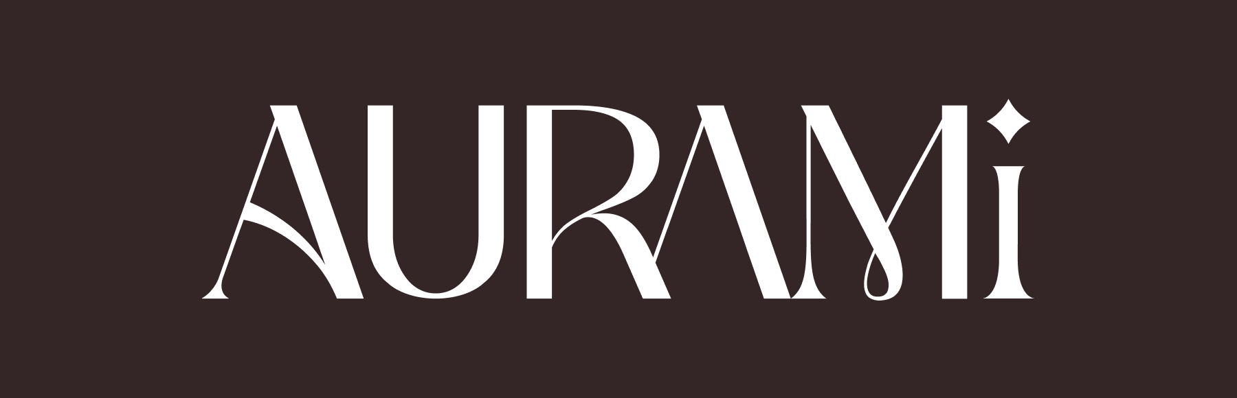
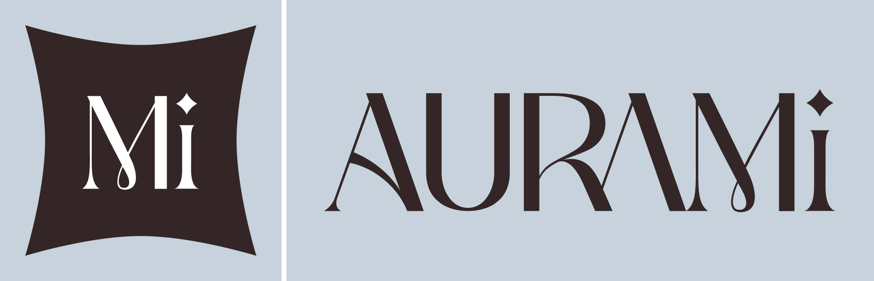
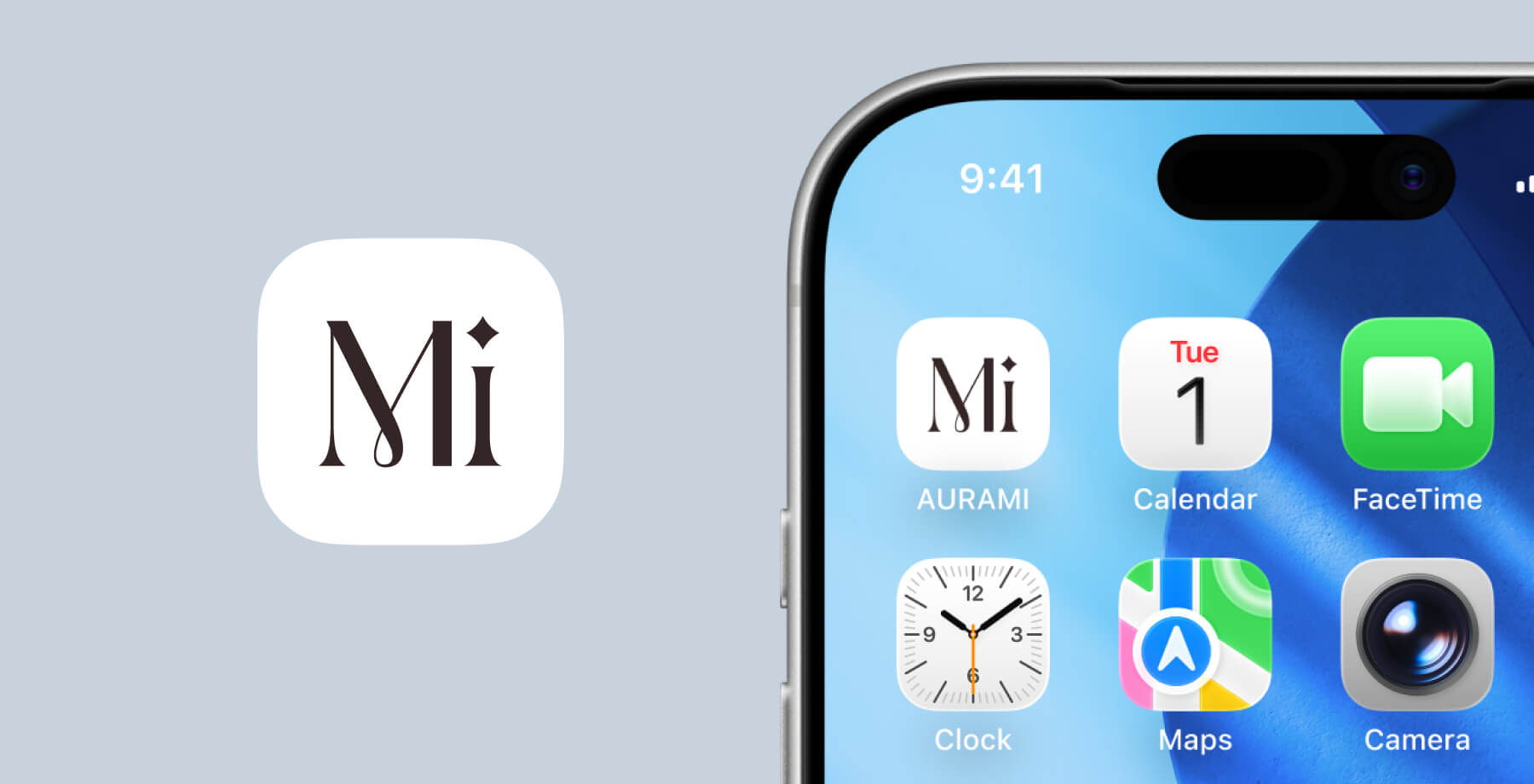
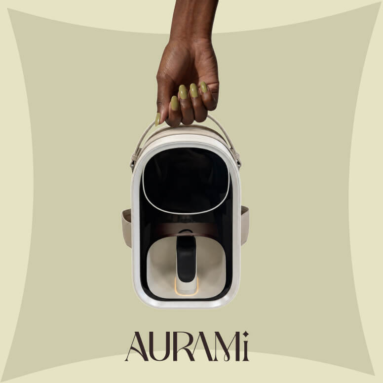
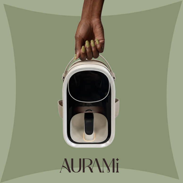
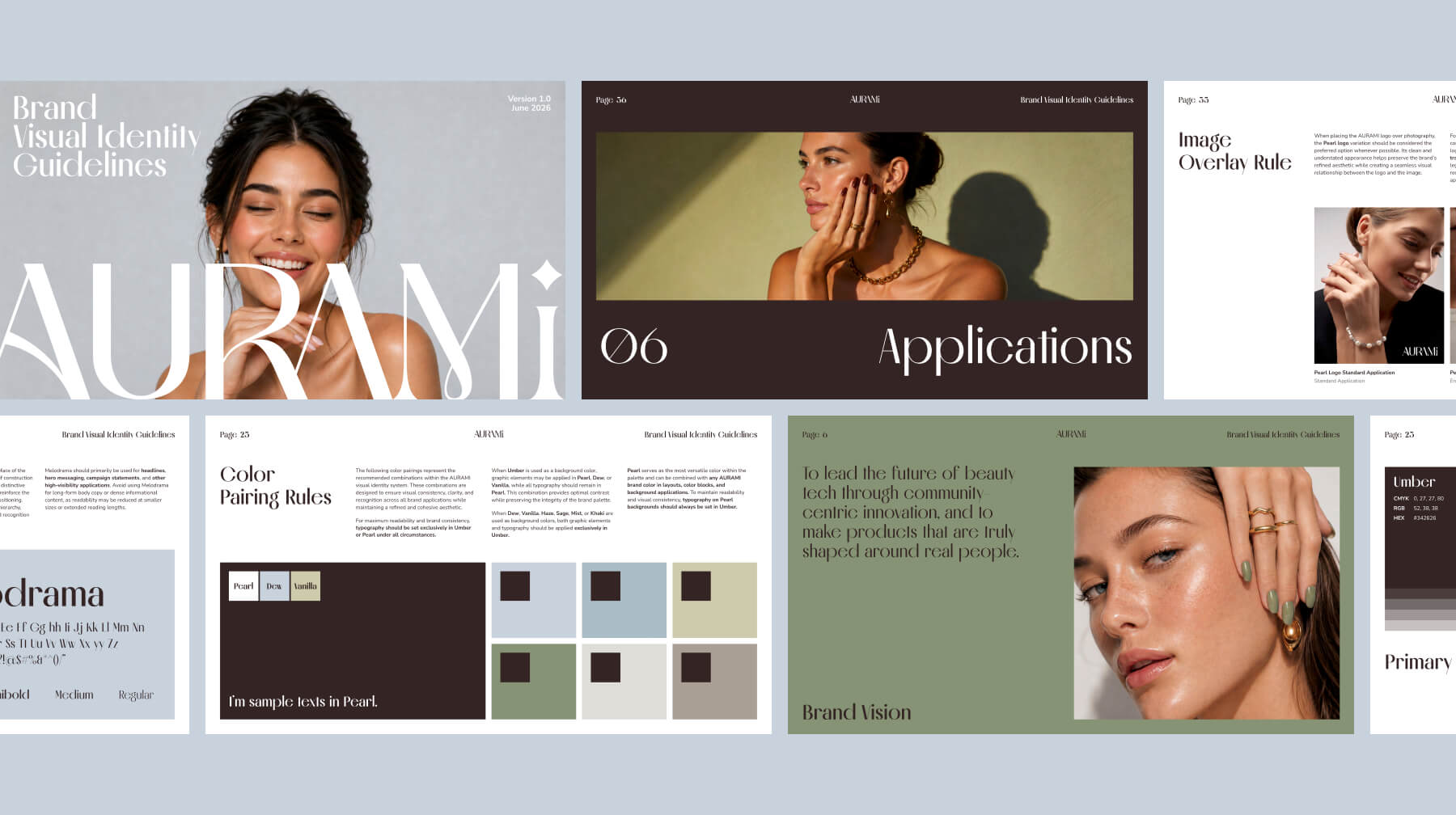
This strategic foundation informed every design decision that followed. Rather than adopting the overly clinical aesthetics often seen in technology brands, or the soft, trend-driven visuals common within beauty, we developed a visual identity that balances structure with elegance. A distinctive wordmark logo became the centerpiece of the identity, using refined proportions, high-contrast letterforms, and a signature star detail to create recognition through restraint rather than decoration.

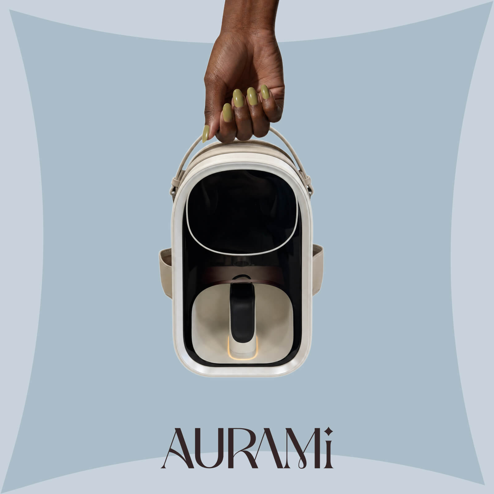
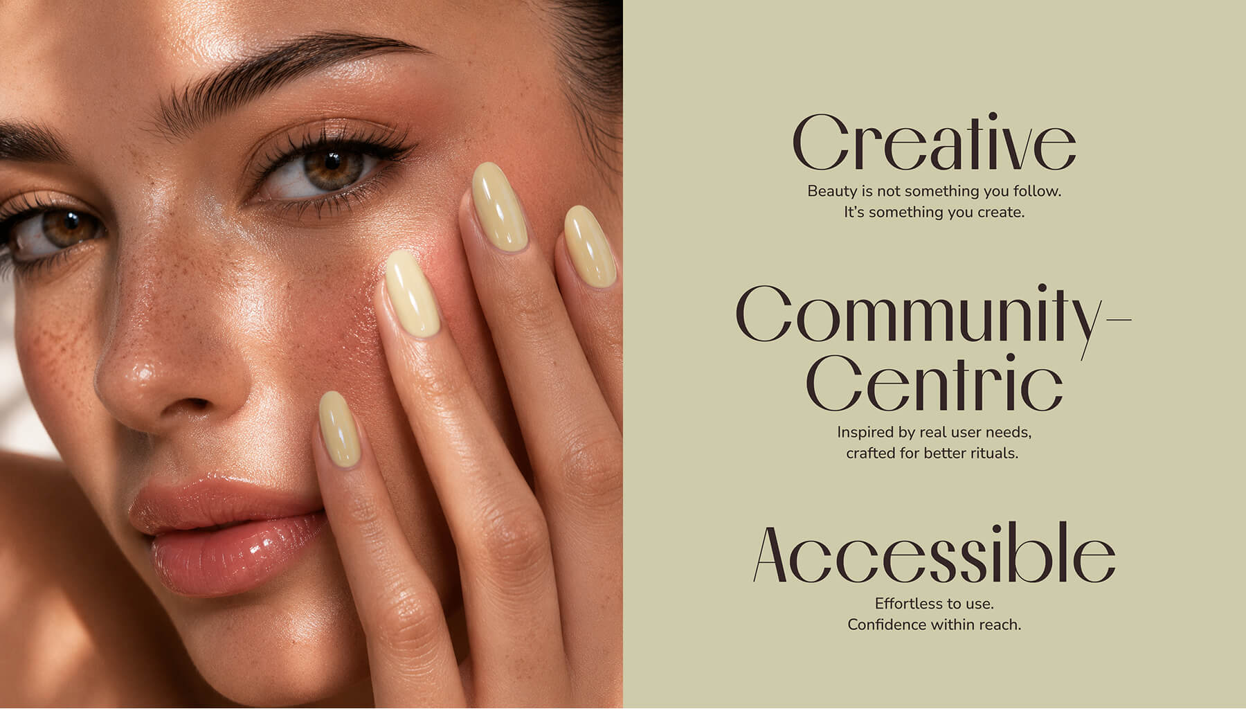
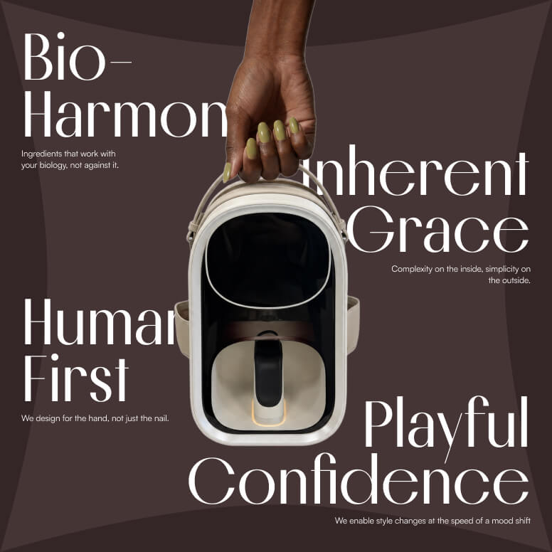
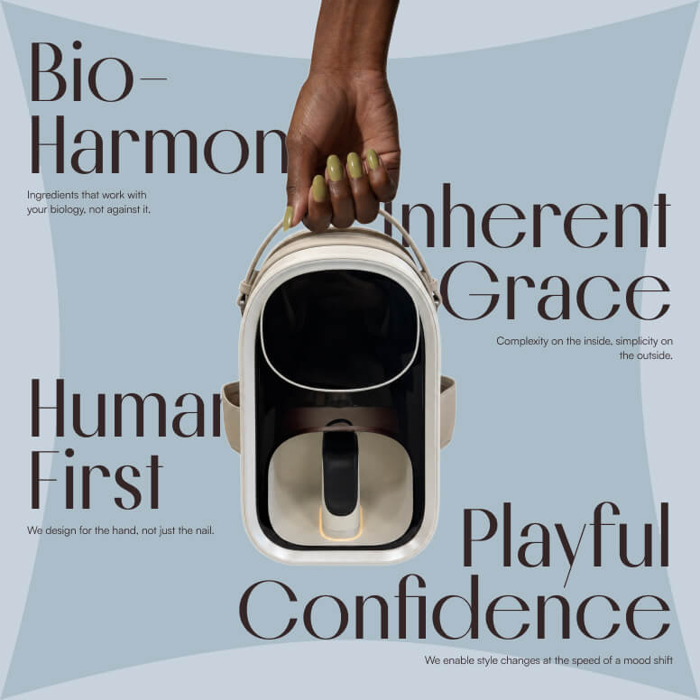
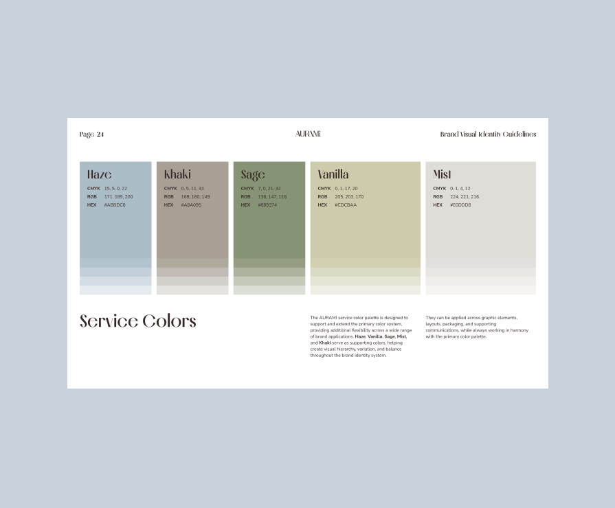
To further reinforce this positioning, we paired the expressive serif typography of Melodrama with the clarity and accessibility of Nunito Sans, creating a visual system that feels editorial yet approachable. The color palette was intentionally built around muted, sophisticated tones—including Umber, Dew, Pearl, Sage, and Vanilla—to communicate calm confidence, premium quality, and contemporary femininity, while avoiding the clichés of traditional beauty branding.

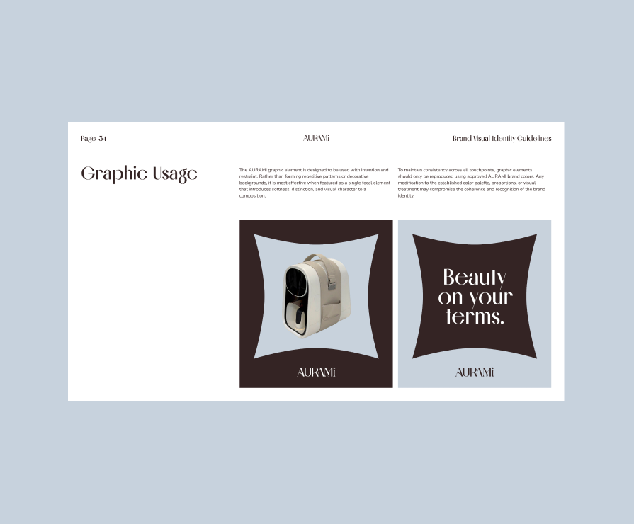
The result is a cohesive brand world that feels elegant, confident, and highly distinctive—translating an undefined market opportunity into a recognizable visual language that can scale consistently across products, packaging, digital experiences, and future brand growth.


Let's turn your idea into reality!

What type of service you would like to inquire?

    CREATIVE. PASSIONATE. DATA-DRIVEN.

    Crowdfunding

      E-Commerce

        Privacy Overview

        This website uses cookies so that we can provide you with the best user experience possible. Cookie information is stored in your browser and performs functions such as recognising you when you return to our website and helping our team to understand which sections of the website you find most interesting and useful.