


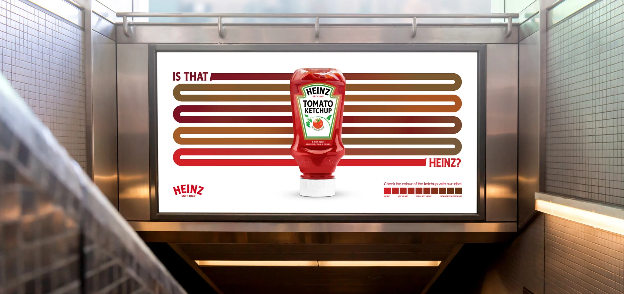
Many companies see branding as a visual upgrade. Just a new logo, colors, or a refreshed website. But strategic brand design goes much further. It defines how a company is perceived, creates consistency across every touchpoint, and develops distinctive assets that help customers remember and choose the brand over competitors, and the brand design itself protects uniqueness and values.
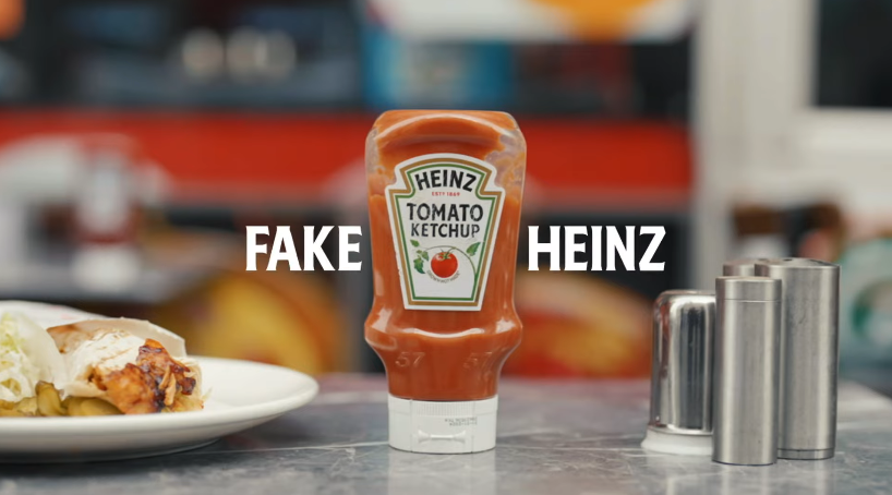
When you spot a bottle of Heinz ketchup at a restaurant, you probably don’t question what’s inside. The familiar logo and iconic packaging look exactly as they should. But in some Turkish restaurants, there was a catch: the bottle was genuine Heinz, while the ketchup inside was something else entirely. To cut costs, some restaurant owners were refilling empty Heinz bottles, famous for being one of the best brands for ketchup in the world, with cheaper alternatives. Customers expecting Heinz could end up tasting a completely different product, with Heinz, the brand owner, taking the blame for ketchup it never made. A clear brand damage.
But think about it for a moment: if saving money was the goal, why were restaurants so determined to keep the Heinz bottle? The answer was hiding in plain sight. The ketchup was replaceable, but the Heinz brand still carried value. In 2023, Heinz and the branding agency Wunderman Thompson Turkey turned this awkward reality into an opportunity with a campaign called Is That Heinz? Rather than relying on elaborate anti-counterfeit technology or an aggressive crackdown, they tweaked a simple rebranding detail to the label, transforming a frustrating business problem into an unexpectedly clever branding idea to protect its legacy built over the years.
01. The brand value hiding in plain sight
▲ Source: FoodTalks
From a business perspective, restaurants serving cheaper ketchup in Heinz bottles presented a genuine distribution problem. The brand was losing potential sales while risking its reputation on products it had no control over. Yet the situation also revealed just how much recognition Heinz had built over time. Restaurants were keeping the bottles because they understood what that familiar packaging communicated to customers. Even when the product inside was different, the Heinz name still carried a certain promise of quality.
This illustrates an important distinction between product features and brand equity. A ketchup recipe, flavour, or even bottle design can be imitated, but the familiarity and trust built through years of consistent brand experience are much harder to reproduce. Heinz’s iconic bottle, label and signature red had become more than packaging elements. Together, they formed a visual language that consumers instinctively associated with the brand. People didn’t need to study the product description to know what they expected from a Heinz bottle.
What made Heinz’s response particularly smart wasn’t an attempt to celebrate the misuse of its packaging. Instead, the brand recognised an opportunity to highlight something the behaviour had already revealed: if even other ketchups wanted to borrow the Heinz identity, what made the real Heinz worth insisting on? That question became the starting point for the entire campaign.
02. Giving a familiar brand colour a new purpose
▲ Source: Wunderman Thompson Turkey
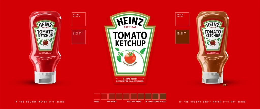
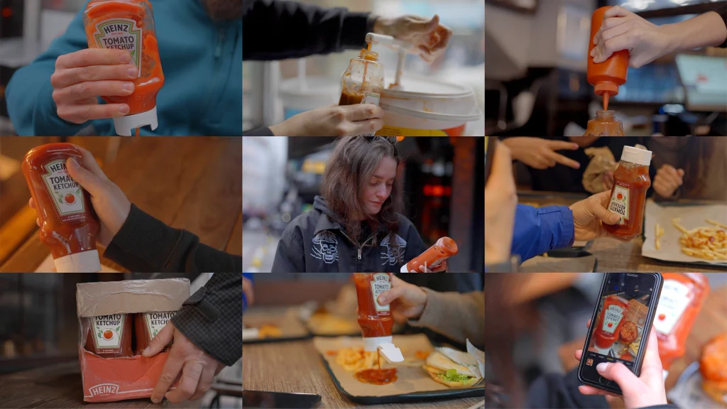
The solution was surprisingly simple. The creative team identified the distinctive Pantone-matched red of Heinz Tomato Ketchup and printed it along the border of the bottle’s label, creating a visual reference to the brand that customers could use to compare the sauce inside. If the colours looked noticeably different, there was reason to suspect that the bottle had been refilled with another ketchup. Heinz also introduced an Instagram filter for colour verification, giving consumers a way to take the experience from the restaurant table to social media.
▲ Source: Wunderman Thompson Turkey
What makes the design interesting isn’t the addition of another colour element, but the new role that colour was given. Previously, Heinz red primarily served as a distinctive visual asset, helping consumers recognise the product on shelves and reinforcing brand associations across advertising and packaging. This time, however, the colour did more than make the product look like Heinz. It became a reference point for identifying the ketchup itself. A familiar design element had found a practical purpose within the product experience.
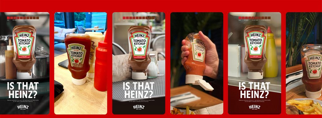
Even the campaign name, Is That Heinz?, followed the same playful logic. There was no stern warning about counterfeit products or another grand declaration of superior quality. Instead, Heinz posed a slightly suspicious question. Imagine enjoying some fries at a restaurant, noticing that the ketchup looks a little off, and picking up the bottle to compare the colours. Suddenly, an ordinary meal has turned into a tiny detective story. Rather than passively receiving another brand message, customers were invited to investigate the difference themselves and perhaps share what they found.
Of course, comparing colours by eye isn’t a foolproof authentication method. Lighting, packaging materials and product conditions can all affect the result. But as a consumer interaction that required almost no explanation, the idea was intuitive and closely connected to how people already used the product. More importantly, Heinz didn’t need to invent an entirely new visual language. It simply gave an existing, highly recognisable brand asset a more meaningful job. From a design perspective, that shift from visual recognition to practical experience is what makes the campaign especially compelling.
03. Turning consumer attention into commercial influence
▲ Source: Wunderman Thompson Turkey
Looking at Is That Heinz? purely as a consumer engagement campaign would miss one of its most important strategic dimensions. After all, the person choosing which ketchup to buy isn’t usually the diner enjoying their fries. It’s the restaurant operator managing costs and margins. Even when customers prefer Heinz, businesses may still choose cheaper alternatives for financial reasons. Simply telling restaurant owners that Heinz offers better quality would bring the conversation back to pricing. Instead, the campaign approached the issue from the consumer’s side, making a previously easy-to-overlook substitution something diners could actively question.
Once consumers started paying attention to what was actually inside the bottle, the purchasing decision became more complicated for restaurant owners. Cheaper ketchup might save money, but serving it under the Heinz name now carried a greater risk of customer complaints and damaged trust. Rather than directly demanding that restaurants purchase its products, Heinz used existing consumer preference to make authentic Heinz a more compelling choice. The campaign played out at the dining table, but the business decision it sought to influence happened behind the scenes.
According to campaign results reported by the creative agency and featured by Contagious, 97% of consumers were able to distinguish genuine Heinz from imitations. Non-Heinz ketchup refills reportedly decreased by 73%, while Heinz ketchup usage among Turkish street food restaurants increased by 24%. These figures are agency-reported, with limited public detail on sample sizes and independent verification, so the improvements shouldn’t all be attributed to the label alone. Nevertheless, they indicate that the idea went beyond generating attention. It connected consumer participation and brand recognition with a genuine commercial challenge, giving a relatively small packaging change a much larger role in the business.
04. What brands going global can learn from Heinz
▲ Source: CNW Group/Kraft Heinz Canada
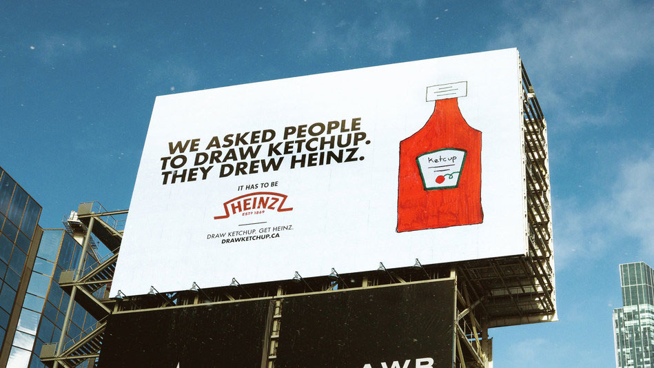
Looking across Heinz’s marketing over the years, a pattern begins to emerge. The brand has a talent for finding fresh stories in characteristics consumers already know. In 2021, Heinz and brand creative agency Rethink launched Draw Ketchup, inviting people to draw ketchup from memory. Many of the drawings naturally resembled the iconic Heinz bottle. In 2023, Rethink’s Ketchup Fraud campaign used dramatically staged imagery to expose restaurants secretly refilling Heinz bottles with other ketchup. Although these ideas came from different creative teams, they shared a common approach: rather than constantly inventing new selling points, Heinz found new ways to make its established brand associations relevant and memorable.
This thinking is particularly relevant to brands entering international markets, especially those in consumer technology and hardware. Many have excellent products, impressive specifications, and the ability to innovate quickly. Yet technical advantages can be short-lived, and similar products often follow close behind. When everything on the shelf or in search results begins to look alike, consumers may remember a useful feature without remembering which brand offered it. Product competitiveness matters, of course, but relying entirely on specifications makes it much harder to build a lasting identity.
Heinz offers another way to think about differentiation. Instead of constantly searching for the next standout feature, brands can look more carefully at the distinctive qualities they already possess and are willing to build on over time. It might be a signature material or colour, a consistent industrial design language or a particular interaction that runs through the product experience. None of these elements is necessarily impossible to copy. What is much harder to reproduce is the familiarity and trust consumers develop through repeated encounters and real use. For emerging brands, those associations won’t appear overnight, but they can be strengthened through consistency across products, packaging, websites and everyday communications.
Perhaps the more useful lesson is to make those differences something consumers can experience, recognise or even verify for themselves, rather than simply read about in advertising. A technology brand claiming effortless usability might demonstrate it through a genuinely intuitive interaction. A company built around material innovation could make its advantages tangible through physical details, product demonstrations or meaningful comparisons. What made the branding action of Heinz so clever was that it turned the familiar claim of being different into something customers could actually observe, by adding a brand element that could elevate brand recognition. For brands going global, lasting recognition often begins with this shift from making promises to creating experiences that support them.
Closing
What makes this Heinz branding campaign truly memorable isn’t simply the clever use of a Pantone colour swatch to identify genuine ketchup. It’s the way the brand approached the problem in the first place, leveraging branding to protect its name, quality, and elevate its uniqueness. Faced with an uncomfortable situation, Heinz didn’t limit itself to defending its reputation or confronting the behaviour directly. It asked a more interesting question: Why was this happening, and what did it reveal about the value of the brand? Once the problem was seen differently, the solution no longer had to follow the usual rules of brand protection. It could become something consumers actually wanted to take part in.
For brands, this mindset may be more valuable than any single marketing tactic. We’re accustomed to highlighting strengths and polishing away imperfections, but rarely do we look closely at the things we’d rather not discuss. Sometimes, that’s exactly where the most distinctive brand stories are waiting. The challenge is having the confidence to face those realities, the insight to recognise what they reveal, and the creativity to make that discovery meaningful to others. After all, memorable ideas don’t always come from brands that appear flawless. Sometimes, they begin with the willingness to see an imperfection in a completely different light.
Your brand’s next big idea might be hiding in a challenge worth rethinking. Let’s uncover it together.