



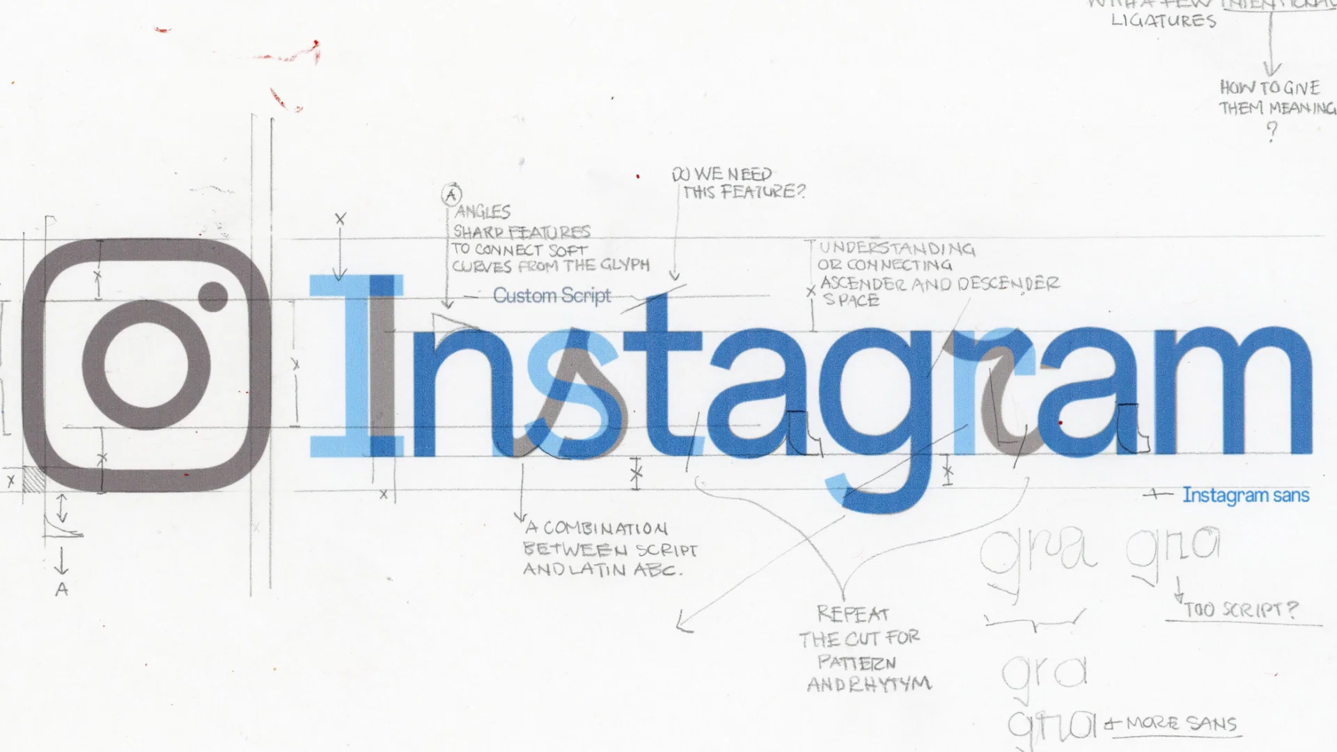
A wordmark that had gone untouched for a decade was redesigned—and within an hour, the internet was calling it by a different name.
For a design team, a rebrand can take months of research, discussion, and refinement. For the public, it often takes only a few seconds to form an opinion. They like it, dislike it, fail to understand it, or turn it into a meme. What a brand intends to communicate and what people ultimately take away can be two very different things.
Why does one change trigger immediate controversy, another earn praise, and a third pass almost unnoticed? The recent updates from Instagram, Tinder, and Lacoste offer three distinctly different case studies. Beyond the loudest reactions in the comments, we wanted to understand what each rebrand was trying to solve—and why each one was received so differently.
Instagram: It set out to restore a handwritten feel. The internet read “Instagzam.”
On August 13, 2026, Instagram updated the wordmark displayed at the top of its app. It was the first change to the mark in ten years. The previous version was a rounded, continuous script. The new one retains cursive forms in the s, r, and g, while the remaining letters sit closer to a geometric sans serif. The strokes are heavier and the overall form more compact. At the same time, Meta also introduced three companion typefaces: Instagram Sans, Instagram Pen, and Instagram Mono.
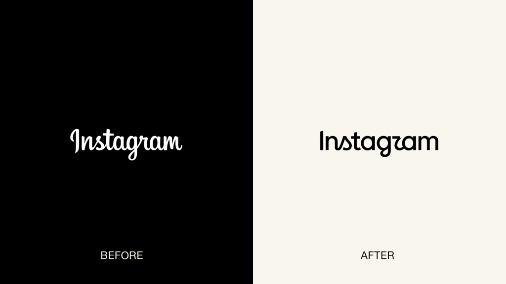
▲ Comparison of Instagram’s 2016 and 2026 wordmarks, Source: Meta Blog
According to Instagram, the team explored hundreds of directions, from all-caps lettering and camera symbols to literal handwriting, before returning to script. Instagram Director of Product Design Jasmine Probst explained that script carries a sense of individuality and was therefore worth preserving, while the new wordmark was designed to feel bolder and simpler. Instagram head Adam Mosseri offered a more straightforward reason: the mark had not changed in ten years, and it was time for a refresh.
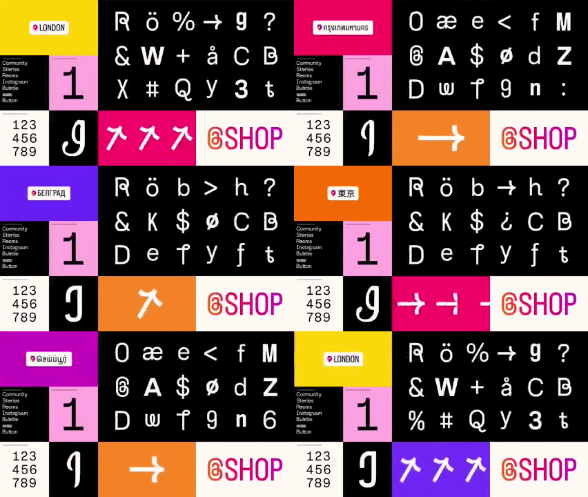
▲ Instagram’s new font system, Source: Meta Blog
The redesign was not simply about visual aging. As AI-generated content becomes more prevalent across the platform, the atmosphere Instagram once created for friends sharing everyday moments and creators expressing themselves has begun to fade. The new identity attempts to bring individual expression back into focus and reposition the brand as something warmer and more personal.
But once the wordmark was released, the conversation quickly moved away from that intention. Within an hour, people were already reading it as “Instagzam.” The main problem was the r. Its cursive flourish sits directly beside the curve of the g. We do not read words one letter at a time; we recognize them through clusters of strokes and overall silhouettes. When those two neighboring curves collapse into one shape, the eye can easily interpret them as a z. Variations such as “Instagwam” and a stream of visual puns soon spread through the comments. According to USA Today, Mosseri’s announcement received more than 2,000 comments in its first hour.
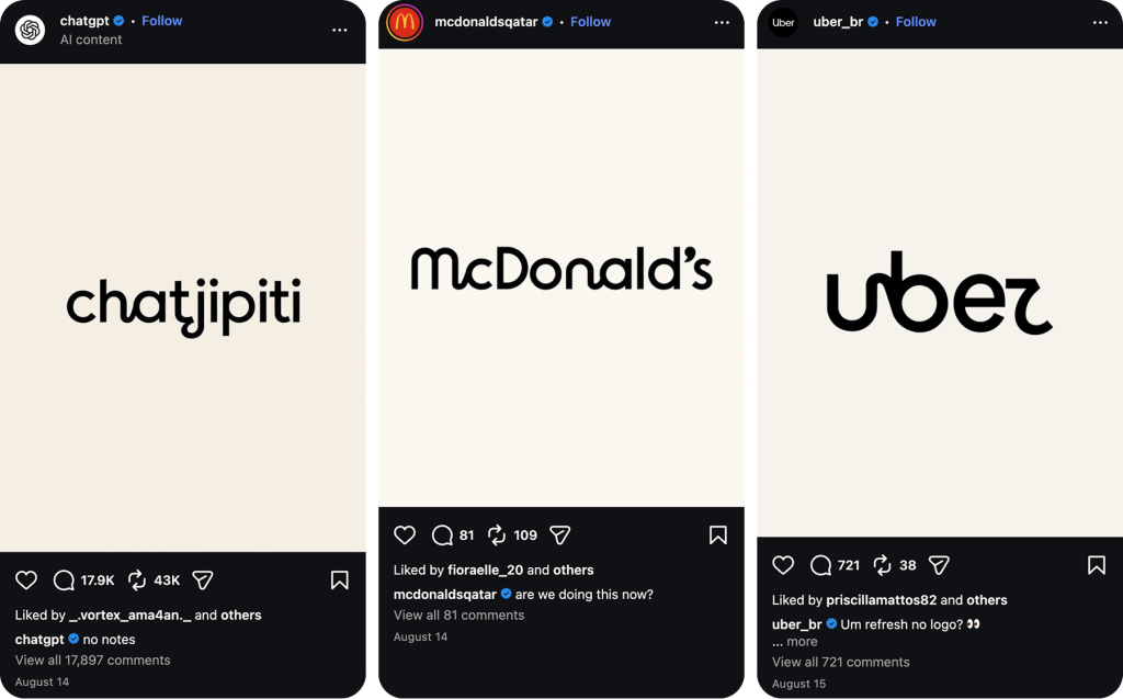
▲ Official brand accounts joined in on the “Instagzam” meme, Source: Instagram
Much of the criticism from the design press focused on legibility. Ars Technica Creative Director Aurich Lawson argued that the wordmark carries the same kind of visual uncertainty often associated with AI-generated imagery: each letter appears almost correct, yet never fully settles into a clearly recognizable form. He was not suggesting that Instagram had used AI to design the logo. His point was that the result had entered a similar uncanny territory. For a platform trying to place authentic expression back at its center, that association was particularly awkward.
Creative Bloq questioned the rationale behind the update itself. Writer Joe Foley argued that “it has been ten years, so it was time for a refresh” was not a strong enough reason for such a visible change to a brand used by billions of people. To him, the new wordmark felt colder, more digital, and harder to read—the opposite of the human quality Instagram appeared to be seeking.
The response, however, was not entirely negative. CNET noted that some users preferred the stronger, more forceful character of the new design. On Instagram’s official design account, others praised it for feeling more energetic and contemporary.
Step back from the disputed letterforms, and the redesign begins to make more sense in context. In its project review, Koto explained that Instagram has grown from a photo-sharing app into a global platform shaping culture and the creator economy. The camera icon is already an established brand asset, while the wordmark had remained largely unchanged even as the platform’s scale and purpose expanded around it. Today, the mark has to do far more than sit at the top of an app. It needs to support global campaigns, creator content, and a growing family of products such as Instants and Edits. Its role is far broader than it was ten years ago.
Koto described the result as “a new mark with old memories.” Rather than discarding more than a decade of recognition, the design attempts to preserve Instagram’s handwritten character and instinct for self-expression in a new form. Meta Brand Design Director May Hartono also explained that the wider system is intended to let the interface and brand elements recede, giving users’ content and expression greater prominence.
So while the public saw a rapidly spreading “Instagzam” meme, the design team was trying to address a long-standing imbalance between Instagram’s brand assets and the platform it has become. Both can be true. The legibility issue is real, but whether it causes lasting damage will only become clear as the wider system rolls out. The more important question is whether the refresh ultimately helps Instagram articulate what kind of platform it wants to become again.
Tinder: The visuals moved first. Now the product has to deliver.
Tinder unveiled its new identity in July 2026, developed by New York design studio Porto Rocha. The refresh extends across the entire brand system. Its lowercase sans-serif wordmark became an all-caps TINDER; the familiar flame was redrawn with sharper, more angular forms; and blue and green were added to the signature red-to-pink gradient to represent a broader range of relationships and possibilities.
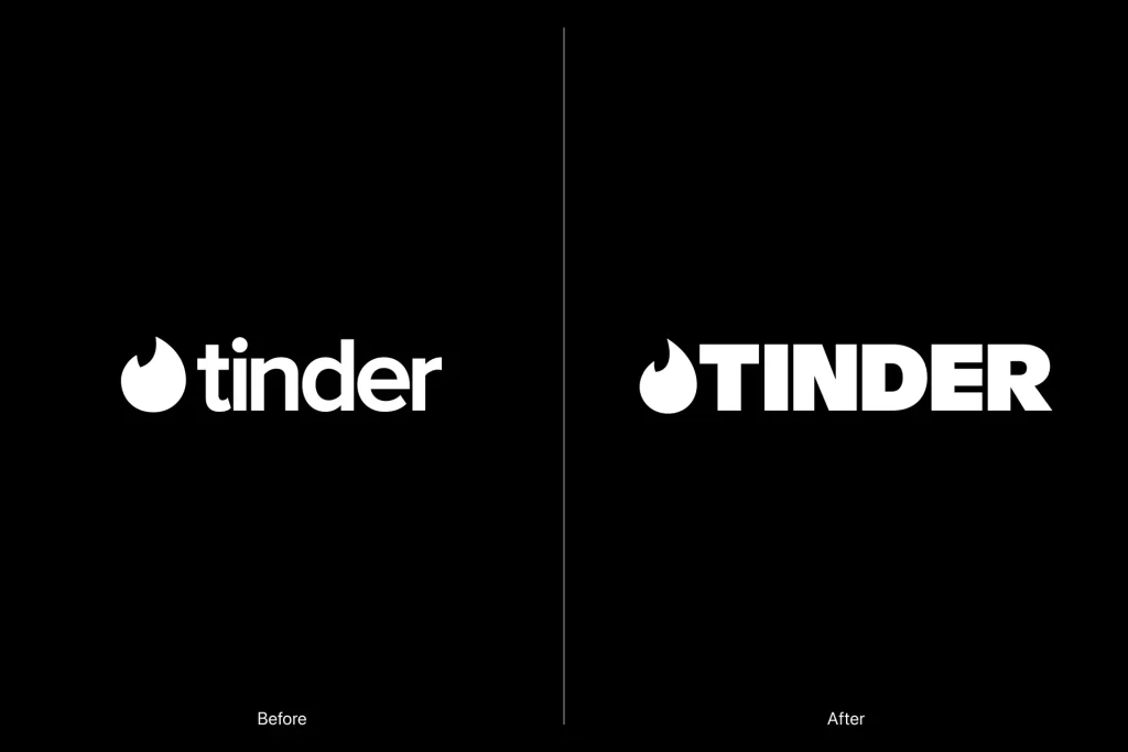
▲ Comparison of Tinder’s previous and new logos, Source: It’s Nice That
The brand also created “T,” a fictional dating columnist. A little like Carrie Bradshaw in Sex and the City, she is experienced and perceptive, yet still willing to sit with users through the uncertainty and hesitation of modern dating. The central concept, “Happily TBD,” moves away from presenting dating as a fixed journey toward finding “the one.” A relationship can lead in many different directions, and the brand now leaves room for all of them.
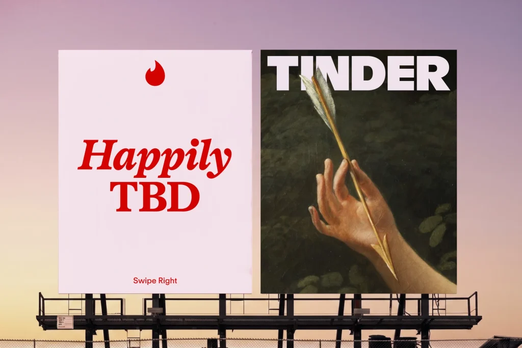
▲ Source: It’s Nice That
Visually, the system deliberately preserves a sense of collage and imperfection. Polaroid photographs, fragments of oil paintings, anime screenshots, and internet memes all coexist within the same identity, creating a visual language that feels native to online culture. The team wanted Tinder to move beyond being a neutral dating utility and become a platform with a point of view and cultural awareness—one that could respond to Gen Z’s growing fatigue and skepticism toward dating apps.
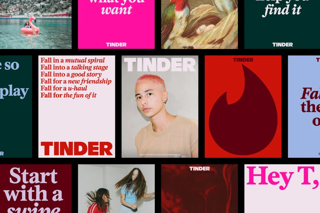
▲ Source: It’s Nice That
Early reactions positioned Tinder as one of the winners of this round of rebrands. Creative Review described the new identity as “sharper” and “wiser,” arguing that it reinforced Tinder’s position as a category leader. Many commentators also welcomed the brand’s willingness to take a clearer stance, with some calling it one of the most noteworthy rebrands of 2026.
But beneath the praise was a more important question: could the product live up to the attitude expressed by the brand?
Jade Horton, Strategy Partner at Elmwood, argued that a point of view cannot simply be narrated; users need to experience it. The character of “T” is designed to show that Tinder understands modern dating. But if the product itself demonstrated that understanding, the brand might not need a fictional figure to keep saying it. Ultimately, people judge brands by the distance between what they say and what they do.
That gap is the clearest tension in Tinder’s refresh. On one side, the new identity speaks warmly about honesty and authentic connection. On the other, the product has been exploring a feature that would allow AI to analyze users’ camera rolls and assess their “chemistry.” The figures cited by Horton suggest that although Gen Z is willing to share data with social platforms, it is also deeply skeptical of AI security and how brands handle personal information: around 72% distrust AI security, while only 39% trust brands with their data. Once the feature became public, descriptions such as “creepy” and “surveillance” quickly gained traction across social platforms.
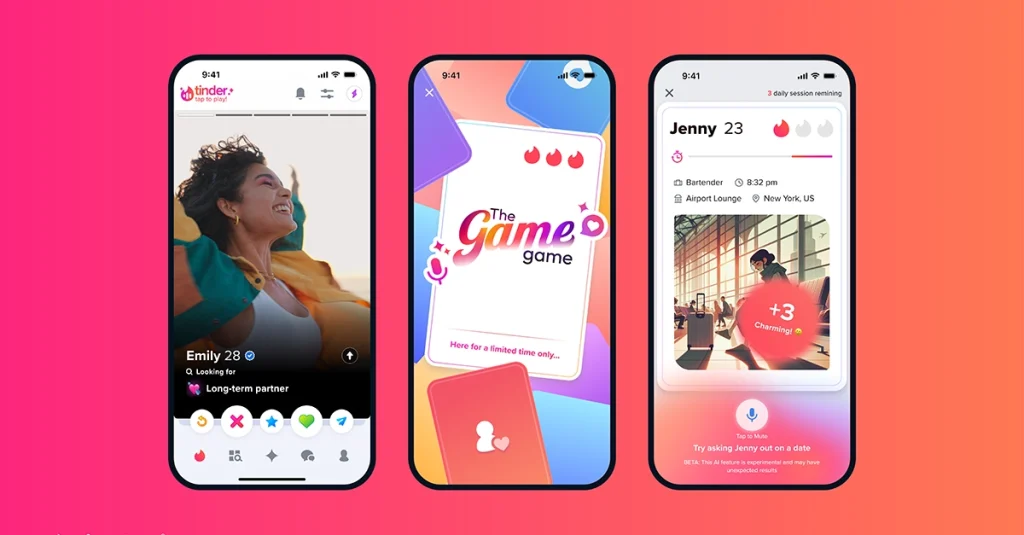
▲ Source: Tinder Newsroom
Another line of criticism concerned distinctiveness. Atlas OOH argued that the system was polished, flexible, and carefully considered, but built almost entirely from visual languages that had already defined the previous decade: oversized editorial serifs, bold color clashes, jelly-like 3D icons, internet humor, and self-aware outdoor copy. Each element works on its own. Together, however, they can feel more like a summary of established design trends than the beginning of a new visual language.
That expectation is understandable. Tinder once defined an entire generation’s dating behavior, and “swipe right” has long since entered popular culture. A brand with that history is naturally expected to propose what comes next, rather than simply use what is already familiar with confidence.
Instagram and Tinder therefore face different problems. Instagram’s intention was misread at first glance. Tinder’s position is clear, but users are asking whether the product can substantiate it. The first is a problem of communication; the second is the distance between a brand promise and the experience behind it.
Even so, Tinder’s new identity responds to a genuine problem. Over the past few years, the platform has struggled with declining trust among younger users and the perception that algorithmic matching has replaced authentic connection. What it needed was not only a better-looking logo, but a clearer account of how it understands relationships today. Porto Rocha gave Tinder a distinct point of view and posture, which may be the most valuable part of the refresh. Whether that expression changes how people feel about the platform will depend on the product’s willingness to follow through.
Lacoste: No sweeping overhaul—just a clearer visual order.
In April 2026, Lacoste, the French brand approaching its centenary, introduced a new visual identity. Its familiar green crocodile was not completely redrawn; instead, its proportions and applications were made clearer and more consistent. The more substantial changes took place across the wider system. Lacoste returned to the serif typography found throughout its archives and developed a bespoke typeface from it. The crocodile’s existing red tongue became more visible in selected applications, while the signature green was restored to a richer tone closer to its historic form. New colors also reference the clay of tennis courts and the off-white of René Lacoste’s first blazer.
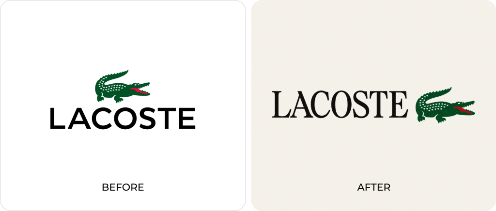
▲ Comparison of Lacoste‘s previous and new logos, Source: Lacoste
The identity was developed by Commission Studio in collaboration with Lacoste. Its central idea is clear: rather than inventing an entirely new expression, the brand returned to its own history and reorganized the visual assets that had always belonged to it.
The move also responds to the visual convergence that has shaped fashion branding over the past decade. In pursuit of modernity, many brands abandoned distinctive serif wordmarks for increasingly similar sans-serif identities. Their visual systems became cleaner, but the differences between them also began to disappear. Lacoste chose another route. Instead of chasing the same idea of “modern,” it went back to the archive and recovered the elements that make Lacoste recognizably Lacoste.
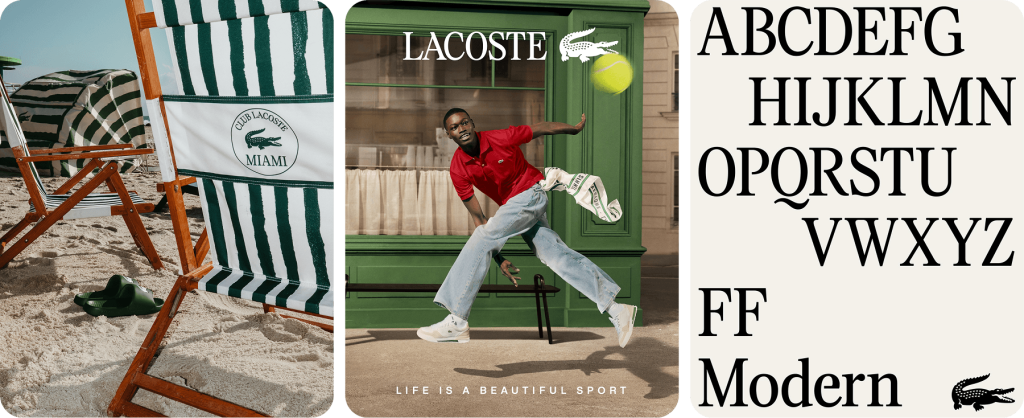
▲ Lacoste & Commission Studio
Compared with the other two cases, the change was remarkably quiet. Most of the conversation remained within fashion and design circles, with little visible reaction from the wider public. Lacoste was still addressing ambitious goals around brand elevation and repositioning, but it did not rely on a dramatic logo reveal to generate attention. Instead, it focused on typography, color, and application rules deep within the system. The crocodile remained immediately familiar, while the identity around it began to feel subtly different.
Designit Chief Design Officer Niklas Mortensen has observed that, in a period defined by continuous change and repeated crises, people instinctively hold on more tightly to familiar things. In that context, any uninvited form of “modernization” can feel like a loss. A logo never exists in isolation. It connects typography, color, tone of voice, product experience, and the memories people have accumulated around a brand. Change the logo, and the entire relationship between the brand and its audience comes under renewed scrutiny.
Lacoste may have avoided widespread backlash precisely because it left the most emotionally charged part of the identity intact. It preserved the crocodile recognized across generations and concentrated its changes on details that most people may struggle to name, but can still feel.
The long-term effect will take time to assess. Even so, the project offers another way to think about rebranding: a brand does not need a dramatic before-and-after moment to prove that something has changed. Reorganizing existing assets and making every detail more consistent and distinctive can be a more appropriate form of progress for a mature brand.
Closing thoughts
Taken together, these three cases make it difficult to reduce a rebrand to whether the logo “looks good.” Instagram released a broader brand system amid controversy. Tinder established a clear attitude through its identity and now needs the product to deliver on it. Lacoste protected existing recognition while placing most of the change deeper within the system. Each brand was at a different stage, so each chose a different path.
Yet all three point to the same challenge: what a brand wants to change and what its audience is prepared to accept do not automatically align. Design has to respond to the future while understanding why people remain attached to the past. A visual identity can create new expectations, but the product and experience must make those expectations credible.
It is still too early to declare any of the three an unequivocal success. Instagram’s new system is still rolling out. Tinder’s promise must be tested through its product. Lacoste’s changes will reveal their value through consistent use over time. The final answer will not be found in the comment section on launch day.
If your brand is approaching a similar point of change, we would be glad to talk. Before asking what the logo should look like, we would rather understand what this change needs to solve. 👉 Get in touch