In early 2025, the digital world feels like a high‑speed assembly line: AI tools are generating logos, landing pages, social posts, even entire marketing campaigns at lightning pace. By some estimates, over 74% of newly published webpages this April contained AI-generated content. Meanwhile, economists warn of a sluggish recovery under persistent tariffs and consumer skepticism. Global consumer sentiment remains below rebound thresholds, signaling continued wariness and a pullback in discretionary spending.
In this complex climate, brand exposure is cheap—but brand trust and emotional resonance are increasingly scarce.
The Pressure Is Real: Why Rebranding Isn’t Cosmetic Anymore
Let’s face it—AI has made content creation astonishingly easy. With a prompt and a click, anyone can generate logos, landing pages, even brand manifestos that look… well, good enough. But here’s the catch: “good enough” is now the baseline. And when everyone starts sounding polished, perfect, and eerily similar, consumers tune out. In fact, recent surveys show that over half of consumers say they interact less with content they believe is AI‑generated—and a quarter describe that content as cold or impersonal.
Might not be a causation, but definitely another consumer fact is that at the same time, customers’ trust is being lost in the market. A global survey shows 71% of consumers trust companies less than a year ago. So while content may be easier to make than ever, earning attention—and trust—has never been harder.
People don’t just want deals anymore; they want meaning, reassurance, and a sense of connection. In a landscape of copy-paste design and corporate jargon, the brands that stand out aren’t necessarily the ones with the best deals—but the ones that feel most alive, real, safe, and more aligned with their values.
Trend I: Brands Are Becoming More Human
In 2025, several major brands quietly shifted how they express themselves—not just updating logos but revealing personalities. These aren’t mascot gimmicks; these are strategic identity transformations grounded in human connection.
*▲Source: Airbnb*
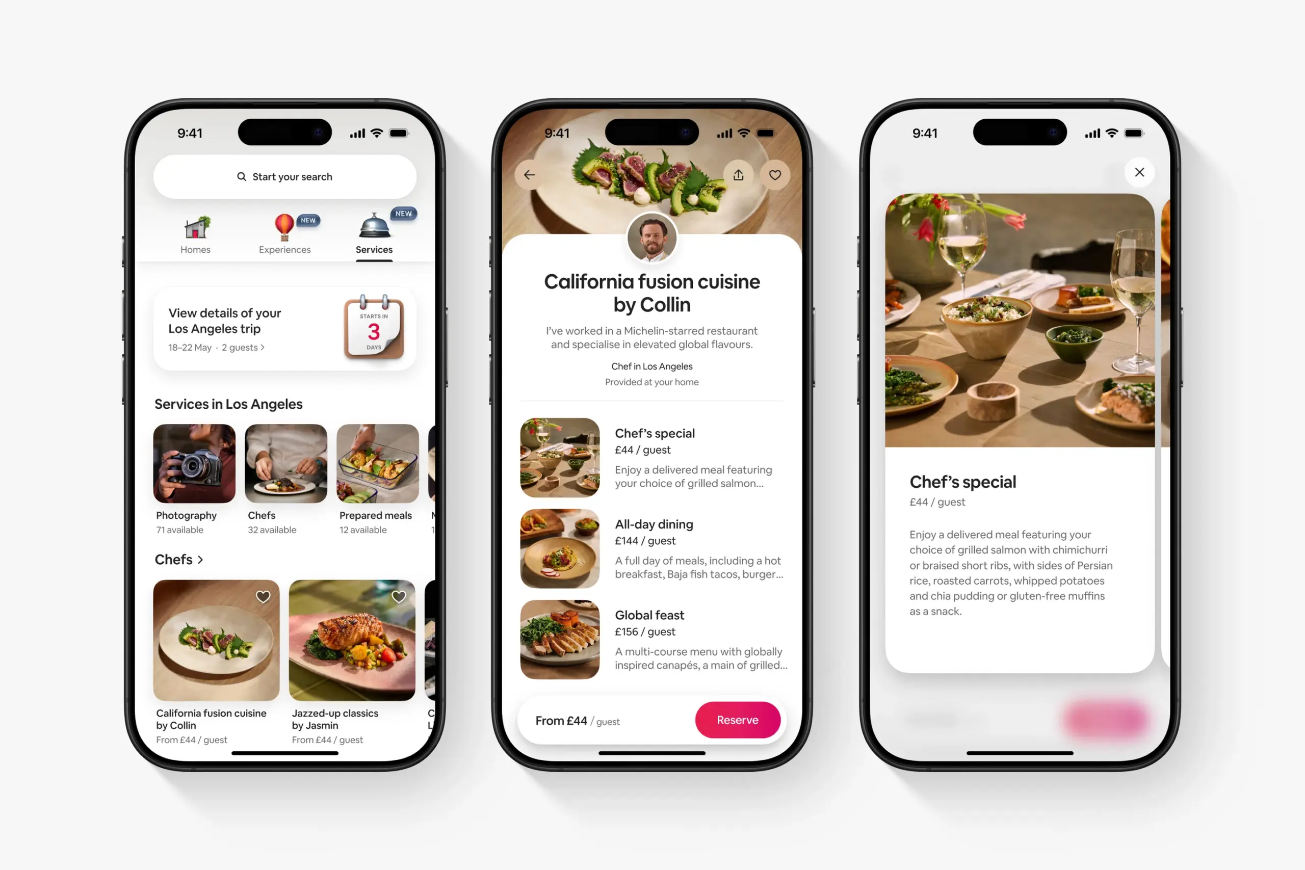
Airbnb illustrates this shift vividly. In summer 2025, Airbnb released an all-new Airbnb app—a significant shift from being a place to book homes into a platform that curates whole trips. The redesign introduced a new tab called “Services,” offering things like private chefs, massage therapists, tour guides, and more. But the transformation wasn’t just functional—it was deeply emotional. As Airbnb’s team put it, the new experience “had to be intuitive, browsable, and genuinely useful – while still feeling unmistakably Airbnb: fun, alive, and simple.”
Visually, the app now leans into playful, characterful iconography and fluid motion design. Tiny animations—a floating hot air balloon, a bubbling pot, a bouncing icon—make the experience feel gently alive. Copy tone has shifted too: instead of transactional commands, you’re met with friendly cues like “Plan something lovely” or “Need help deciding?” Airbnb’s brand voice no longer sounds like a product—it sounds like a person.

*▲Source: OpenAI*
At the top of the AI pyramid, OpenAI has undergone its first-ever official rebrand, intentionally leaning into humanity. Their in-house team, with ABC Dinamo and Studio Dumbar, overhauled the Blossom logo to improve symmetry and line consistency, creating a mark that represents the intersection of humanity and technology—circles for warmth, angles for precision. They introduced OpenAI Sans, a bespoke font that merges geometric clarity with soft curves, notably including an “O” that is perfectly round outside but imperfect inside—designed to feel human rather than robotic. Their color palette shifted from stark tech blue to horizon-inspired greys and soft blues, complemented by photography and pattern art from both photographers and their own Sora model, reinforcing the message: OpenAI sees itself not as a silicon overlord, but as a collaborator in human creativity. As Veit Moeller, Head of Design, stated, the brand language is built “on the nuances of human experience—the way an image evokes memory, how typography carries tone, and how motion breathes life into ideas”.
*▲Source: Duolingo*
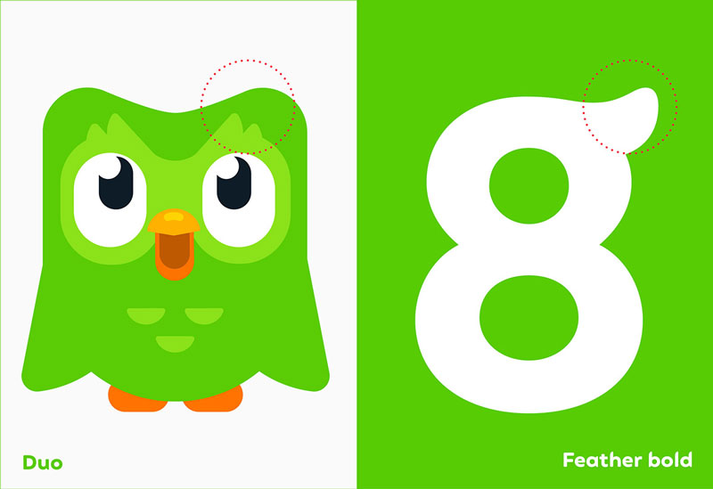
Meanwhile, Duolingo has doubled down on character-led strategy. In Q1 2025, it rolled out a custom font “Feather Bold,” inspired by the character Duo the Owl’s feathery shape—bringing visual consistency to Duo’s whimsical personality. Duo now stars in viral TikTok and tweets where the mascot both encourages and guilt‑trips you home to do your lessons—melancholic humor with a motivational punch. This personality-driven approach isn’t performance—it’s brand DNA—with push notifications and emoji-laden copy serving as emotional touchpoints.
Trend II: Visual Boldness as Brand Signal
If the 2010s were about minimalism, the mid‑2020s are about making noise—with clarity. In an endless scroll of templates, generative sameness, and saturated feeds, brands in 2025 are turning up the contrast—literally.
*▲Source: Walmart*
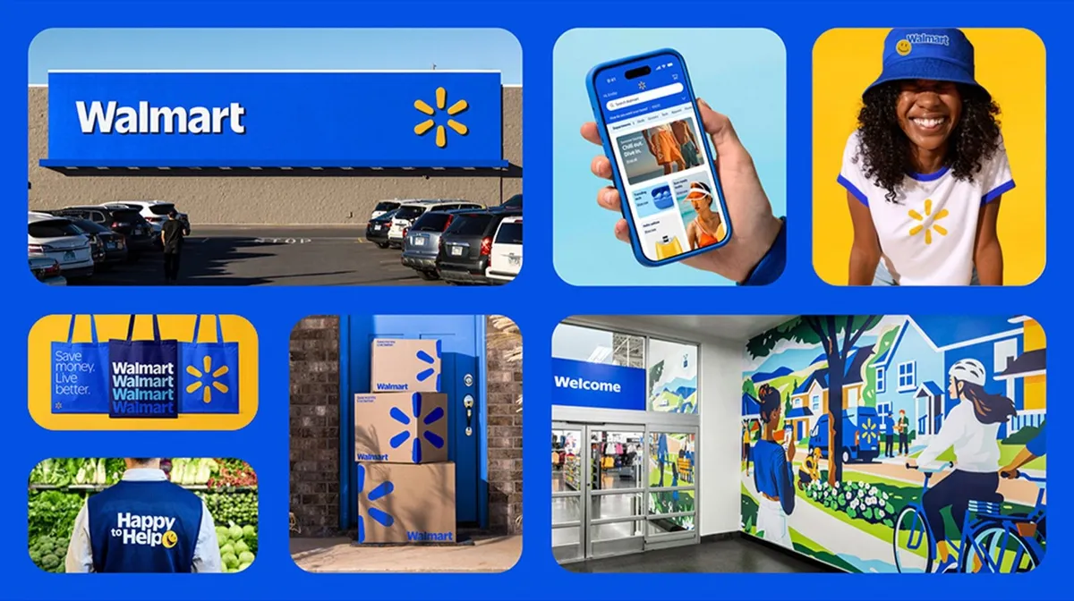
Take Walmart as an example. In 2025, the company unveiled its first major visual overhaul in nearly two decades. The refreshed brand system features bolder typography, cleaner layouts, and a super-saturated “True Blue” paired with a bright, standalone “Spark Yellow.”
A new custom typeface, Everyday Sans, was introduced to give the wordmark a blockier and more confident look, drawing subtle inspiration from founder Sam Walton’s iconic trucker hat. The familiar spark icon remains but now appears more independently across app icons, packaging, signage, and motion design, acting as a flexible brand signal.
Importantly, the redesign isn’t just aesthetic—it serves a functional purpose. Higher color contrast improves accessibility for a broader range of users, while bolder layouts enhance instant brand recall in fast-scrolling environments like social media feeds and mobile screens. According to Walmart, the updated identity reflects the company’s evolution from a traditional big-box retailer into a digital-first, omnichannel brand that serves both value-driven shoppers and a younger, more affluent demographic. Early feedback suggests the redesign is working: consumers report faster recognition, stronger emotional engagement, and a renewed sense of relevance.
*▲Source: Koto*
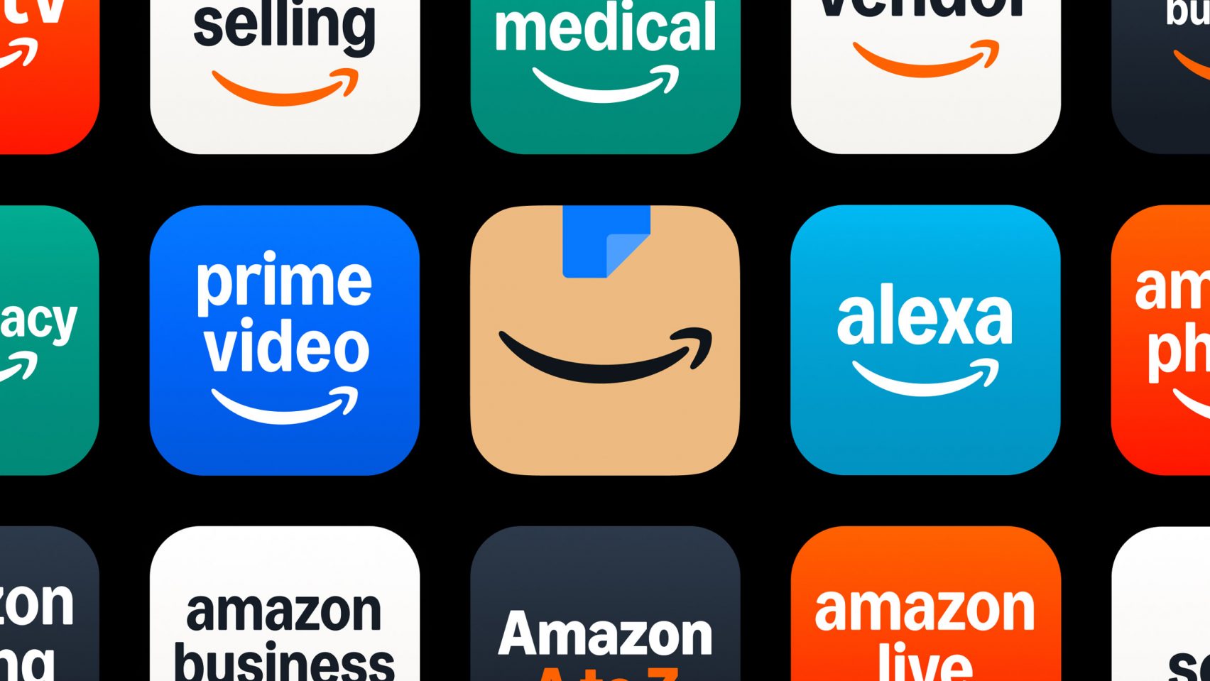
Meanwhile, Amazon undertook one of 2025’s largest brand systems overhauls via design studio Koto, unifying 50+ sub-brands under a single identity architecture. The iconic smile remains central, but it’s now presented in a warmer, more vibrant “Smile Orange.” Across the board, the brand adopted a single, flexible alphabet—Ember Modern—and a broader, more expressive color palette optimized for global use and across 364 supported languages.The result is visually assertive yet familiar, allowing Amazon to show up clearly and consistently whether on packaging, marketing screens, drone liveries, or even Formula‑1 race cars.
These moves aren’t about being louder for the sake of it. They’re about being recognizable, memorable, and emotionally clear. As generative tools flood our screens with content, clarity becomes the antidote to chaos—and color becomes more than decoration; it becomes meaning.
So, What Now?
In 2025, brands are no longer competing on product or even performance alone—they’re competing on clarity, connection, and character. As AI floods every feed with infinite content, and economic headwinds pressure every marketing dollar, the brands that stand out aren’t the ones doing the most, but the ones doing it with the most humanity.
This year’s strongest rebrands—from Airbnb to OpenAI, Walmart to Amazon—reveal a shared instinct: go bolder, go warmer, stay clear. Bold colorçough the noise; warm voices build emotional memory; humanised design offers more brand value to increase customers’ trust and satisfaction.
It’s not about looking different for difference’s sake. It’s about feeling trustworthy, legible, and alive—at a time when most things don’t.
So if you’re rebranding in the age of AI, the real question isn’t “How can we look futuristic?” It’s:
“How can we connect more deeply as humans?”
Curious What This Looks Like in Action?
If you’re struggling to figure out how to lead a brand refresh that actually drives sales—not just aesthetics—take a look at how we helped INNOVV and Keego turn strategy into standout.
From redefining product architecture to building bold, human-first visual systems, Naturality’s creative team helped these brands cut through the noise, capture attention, and drive real results in fiercely competitive markets.
Let’s make your next rebrand more than just a new look. Contact us to make it a turning point.